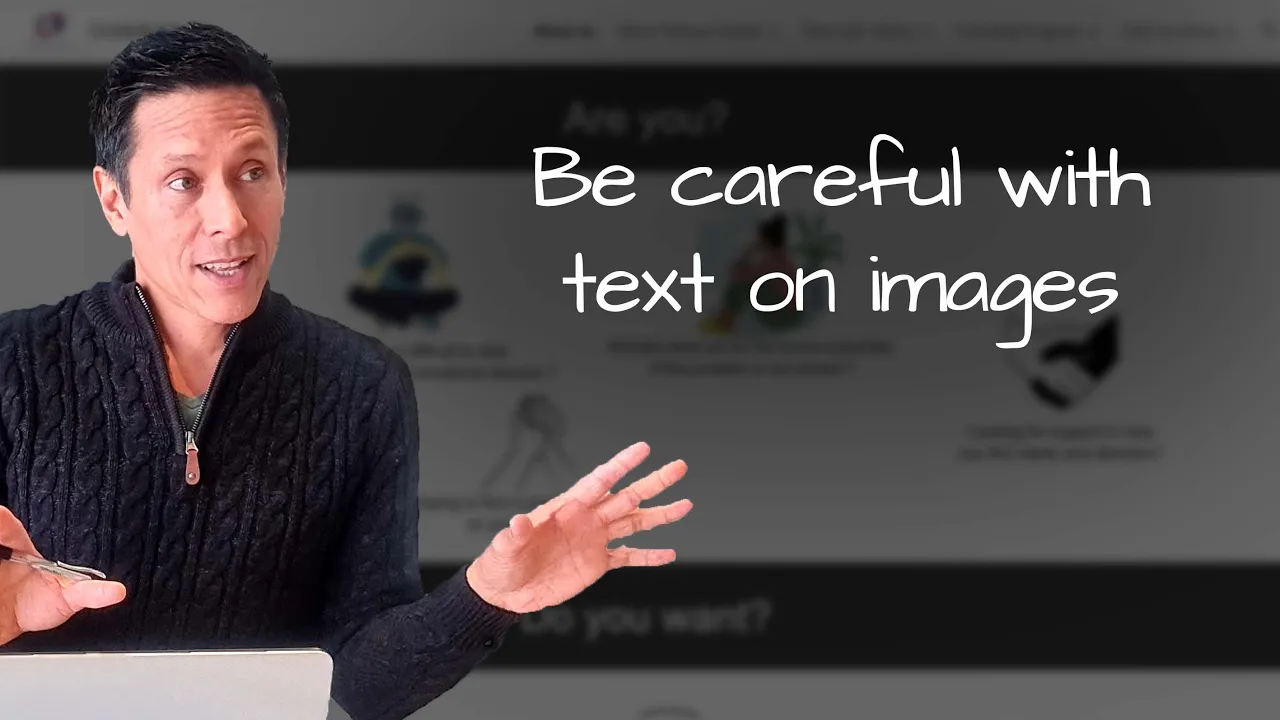
Be careful with text on images
In this website review for mental health coach Mehnaz, I give thoughts to improve her website.
The site has some spacing issues, so it may appear differently on various devices and browsers. However, I liked the clear menu and relevant content.
* The logo could be bigger for better visibility.
* The images should be consistent in width.
* Also, the buttons need clearer styling, and a concise message on the homepage would be beneficial.
* The testimonials section needs font and image size adjustments for consistency.
Overall, the site has potential with a few improvements to enhance user experience.
Want me to review your website? Just comment below to give me your link, and I’ll add it to my list.

