Four Things I LOVE About Carol’s New Coaching Website
I’ve known Carol Leek for a long while now. One of her greatest gifts is building confidence in her clients – and she does it with such enthusiasm, it’s exciting. This talent makes it fun and easy to take action, especially if things feel tough.
While she’s quite busy helping coaches get into money-making mode, she took this past month to take her website to a new level in my course, Build a Great Coaching Website on WordPress.

Here are four things I LOVE about her website and her efforts …
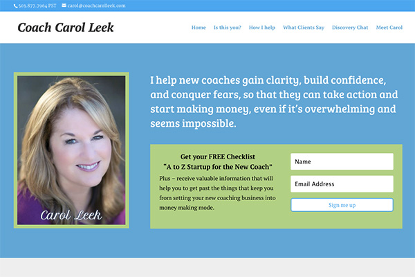
Love 1 – When you do the squint test, the most important thing shows.
When you look at your computer from a distance and squint your eyes, you can easily see her headline.
Visitors to your website NEED to know WHY they should stick around at your site. They need a very good reason to do so.
Carol has a clear, visible, and client-focused, benefit rich headline.
Sweet!
Love 2 – A prominent email list sign-up box.
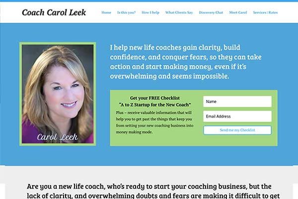
Her invitation to get on her list is right there on the home page, top and unmissable.
Growing a list is a winning move for marketing as it puts you and the subscriber into a situation where the relationship can steadily grow.
What’s great about using email over any other means (like RSS or social media) is that YOU are in full, direct control of the communication – you can just send an email.
Whereas for …
- with Facebook is hard to message everyone and you have to “friend them first” (lots more work, restrictive).
- with Twitter as a limit in message size.
- with RSS (which is a blog reading tool) is only for blogs and clumsy to use.
Anyhow, nicely done with your sign-up box.
Love 3 – She finished EARLY – 12 days early to be exact. Who does that?
I only know stories of coaches taking forever to build their websites – with many never finishing.
She got hers done ahead of schedule.
I know the steps I gave her made things simpler and easier, but she put the pedal to the metal and launched ahead of schedule.
Love it!
Love 4 – The visuals are fresh, crisp, and sharp.
Using very simplified design advice in the course, Carol was able to pick a great color, nice font, and work it all together in a way that look fab.
Great job Carol. I appreciate your efforts.
Congrats on launching!

