Coaching Website Review – Life Coach Ange
Below is a quick, 10-minute video review of Ange Wilcock’s life coaching website at angewilcock.com. (Warning: lots of French here – earmuffs for the youngans).
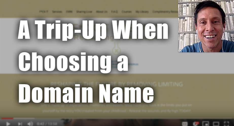
Click here if the video doesn’t show.
As I create, review or enhance websites, I always keep this guiding question in mind, How can I make this website better for attracting clients?
Key points for Ange’s life coaching website:
- I like that the menu is obviously positioned and consistently appearing on all the pages. Nice.
- Make your domain name and logo and immediate impression all line up – so if you use your name in your domain name, then put your face and name right on the top of the home.
- If you’re going to cuss, then own it. Integrate that bravery throughout the content. Not just once on the home page. Own it. Permeate it through.
- Put a concise write-up of what you do on the homepage, pulling together your key benefits (jucified) that your ideal clients will respond too.
- Make the lighter fonts darker to be more legible. Medium colors on medium background make pages hard to read.
- Put a home page link on the menu – it’s what users expect. The way you have it now is too abstract and confusing. Being cute, brandy, clever is OK as long as it doesn’t make your website confusing or harder to use. At least be cautious about it.
- It’s great that your face is on the About page. Many coaches hide with no photo. So good on you.
- A lot more little tweaks and edits are in the video.
When you hit the LIKE button, I get an electric jolt is sent to my cell phone, letting me know you found this helpful. I’ve come to enjoy it. Thanks Pavlov.