Coaching Website Review – Basketball Coach Calvin
Here’s a quick website review for Calvin Wootton. His basketball coaching website is at fba.co.nz
Click here if the video doesn’t show.
As I create, review or enhance websites, I always keep this guiding question in mind, How can I make this website better for attracting clients?
Key points for Calvin’s basketball coaching website:
- I love the energy of colors and font choices. Feels great for sports for kids. Nice.
- The logo and menu are nicely positioned at the top.
- The drop down menu, while obvious enough, overlaps text and is a bit clunky for me. Get a background on the drop down so it shows above the page content when it flies down.
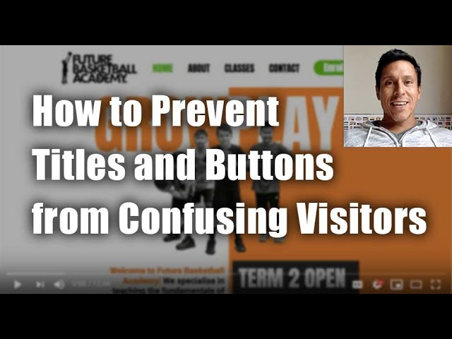
- The thing I struggle with the most is the wide range of headings and buttons and boxes. It confuses me as to what’s clickable and what’s not. I suggest you make buttons look like buttons and consistently use that style. Like green rounded buttons, perhaps with a drop shadow so it pops out like a button.
- On the various classes pages, I’d like a summary of what it is at the top of the page instead of having to scroll 3-4 screens down. I’d simplify those pages and use fewer fonts styles. While the colors and bold lettering is fun, I think it becomes too much. For me at least. Try sitting with someone on their phone and see how much scrolling they do and clicking they do – if it’s a lot, then yes, simplify.
- Make it clear where your classes are available, which appears AKL or perhaps North Shore only.
- Videos of kids in action would be great, but I expect that will come in time (not mentioned in the video).
- Love the vibe, colors and images of kids. Nice.
- A few other smaller tweaks are mentioned.
When you hit the LIKE button, I get an electric jolt sent to my cell phone.
This quick shocker puts a smile on my face knowing that I’m helping someone ;). Thanks for that!