Coaching Website Review – Marriage and Relationship Coach Dan
Below is a quick, 10-minute video review of Dr. Dan Thomason’s marriage and relationship coaching website.
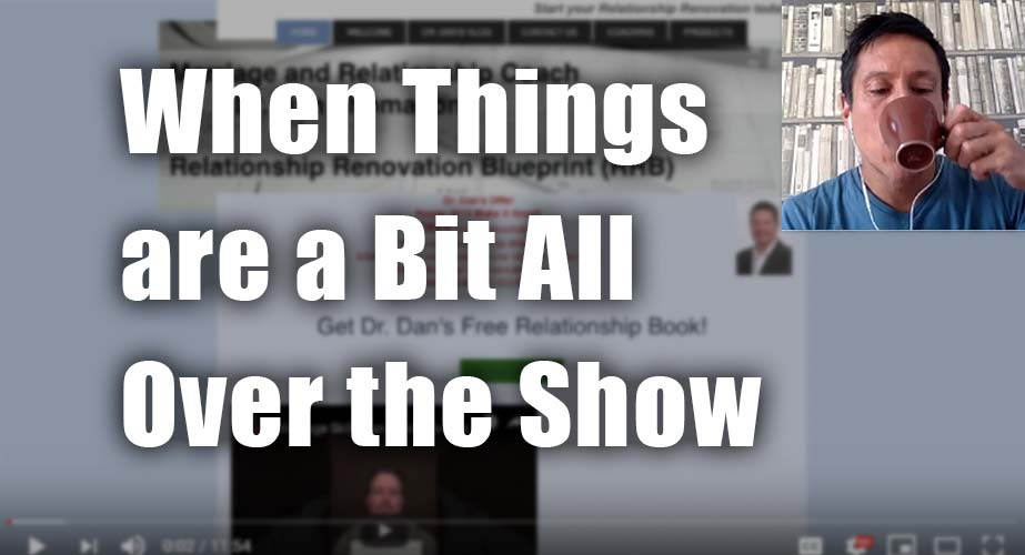
Click here if the video doesn’t show.
As I create, review or enhance websites, I always keep this guiding question in mind, How can I make this website better for attracting clients?
Key points for Dr. Dan’s marriage and relationship coaching website:
- Moving images, almost always distract visitors and a well-chosen still image can do the job nicely.
- Text on top of images are hard to read if the image is complex. Most people mess this up. See what I suggest.
- Think “sections” of content and position them to be obvious. Hierarchy should be apparent.
- Put a juicier sentence or two that encapsulates the essence of what you do at the top instead of scattered “tag-line” kinds of thingies. See what I mean in the video.
- Spend more time on highlighting the value your package offering instead of trying to motivate buyers on price or discounts (which cheapens coaching).
- Dedicate a full page for the free initial consultation. Sell it. See my tips in the video.
- Make a unique, complete page for the eBook and sell it. Use proven good sales content, sure, without being inauthentic, false or cheesy.
- A lot of little tweaks as well to make it slick and neat.
Found this helpful? Just hit the LIKE button here to say thanks. I appreciate it!