Coaching Website Review – High Performance Coach Leslie
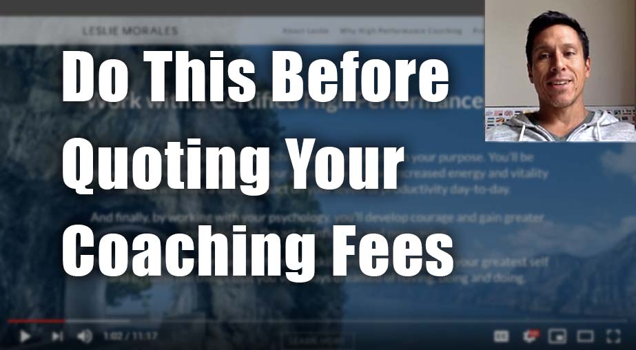
Here’s a quick website review for Leslie Morales. Her high performance coaching website is at lesliemorales.com
Click here if the video doesn’t show.
As I create, review or enhance websites, I always keep this guiding question in mind, How can I make this website better for attracting clients?
Key points for Leslie’s high performance coaching website:
- Your domain name and logo match, fabulous!
- Your menu is super simple and obviously located, excellent!
- The business summary on the home page is a good move. I’d like a simpler message, one that I can quickly read, that rolls off the tongue and that hits on the valuable points of WHY I should be here. As it stands, I find it a bit wordy and a bit to digest due to conceptual words.
- The free session offer felt like 2 separate things, combine that to one clear offer. I’m referring to the second section on the home page.
- The $450 offer for free doesn’t feel right. Perhaps $450 for $200 … but even so, I’d suggest you build the value of the offer as opposed to try to sell it via a discount. You’re not a discount service. Yes, lower fees can help induce action, but I think I need to feel the need of more value from you (I don’t know you and your site hasn’t compelled me to believe the time with you is worth it). If you give talks, get them on here. If you have raving clients, tell their stories.
- Offering Brendon’s book felt weird to me. Not sure what you wanted me to do there. Would I get it for free if I put my name in? Dunno. Remove that.
- Video, probably remove that too, in my opinion, and make your own credibility building video. It feels like space filler to me.
- There are a few other smaller tweaks I’d suggest.
Please do me a solid and hit LIKE.
It really makes my day to know I’m helping you. It’s like a little cyber cookie of feel good hormones that turn my computer face (often too serious) into a loving kindness look (better for my longevity).

