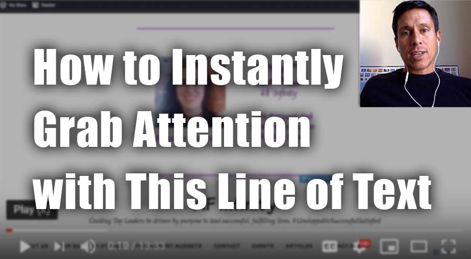
Coaching Website Review – Life Coach Angelica
Here’s a quick website review for Angelica Weaver. Her life coaching website is at afinfinity.com
Click here if the video doesn’t show.
As I create, review or enhance websites, I always keep this guiding question in mind, How can I make this website better for attracting clients?
Key points for Angelica’s life coaching website:
- When I first looked at the domain it was a bit confusing. I wasn’t sure if it was infinity or afinity or its a new made up word. If you share your domain name address I would capitalize AF and leave infinity in lower letters.
- I like that your face is present and your name is under it. The message beside the photo is great – I’m able to sense what the site is about.
- The menu at the bottom is a bit confusing. A menu is to be at the top or at the left.
- Put the logo at the top left of the website.
- Check for typos
- Make the sentence before the menu the biggest font on your homepage.
- Text with background image is unreadable.
- Many more …
Want to say thanks? Just hit the LIKE button here. I appreciate it.

