Coaching Website Review – Life Coach Jackie
Here’s a quick website review for Jackie Meek. Her life coaching website is at futurepathlifecoaching.co.uk
Click here if the video doesn’t show.
As I create, review or enhance websites, I always keep this guiding question in mind, How can I make this website better for attracting clients?
Key points for Jackie’s life coaching website:
- Love the logo position and obvious menu at the top.
- The domain name and website logo match. Great!
- Good color scheme consistency – analogous green / yellow.
- Your “core message” is in a spaced out font (lots of space between letters) which makes it hard to read. Try thickening the font and pull the lettering together with normal spaces.
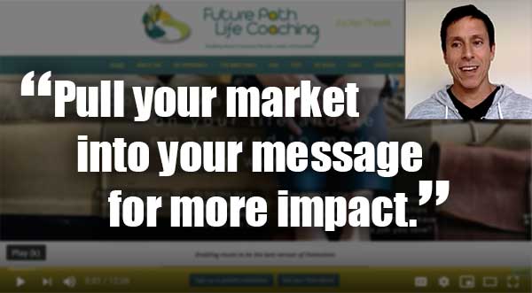
- Pull in your target, mums, into your message to make it more powerful to your ideal clients.
- The menu feels a bit long. I think you can combine a few pages into a page called “Life Coaching” page (good keywords) or “What I Do” (personal, fun).
- Video, fantastic! The combination video and text below it is a home run.
- The invitation to a chat is great to have. Make is stand out with a background color.
When you hit the LIKE button, I get an electric jolt sent to my cell phone.
This quick shocker puts a smile on my face knowing that I’m helping someone ;). Thanks for that!