Coaching Website Review – Life Coach Rosa
Here’s a quick website review for Rosa Beriguete. Her life coaching website is at women-empowermentconsulting.com
Click here if the video doesn’t show.
As I create, review or enhance websites, I always keep this guiding question in mind, How can I make this website better for attracting clients?
Key points for Rosa’s life coaching website:
- Nice job with your logo, good size and positioned nicely in the top left.
- I suggest you start with a concise message of what you do and who you do it for so people can know WHY they should be at your site.
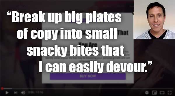
- Remove the buy now, or make it show up later and put an image with it.
- Bump up the menu font 2 sizes.
- Make clear paragraph separations so that it’s easier to read. As it is, much of the copy is big blocks and centered text which is awkward to look at, for me. I resist reading it.
- For buttons, make sure the button wording matches the page it goes to. For examples “Learn About My Services” goes to a “Services” page as I explain in the video.
- Free 20 minute call offer is great to have. I sense that 20 minutes to small. For someone to book time ahead for 20 minutes doesn’t feel worthwhile. I’d spell out why it’s valuable. Sell it.
- The button for the 20 min call isn’t showing on the let’s talk page.
Want to say thanks? Just hit the LIKE button here. I appreciate it.