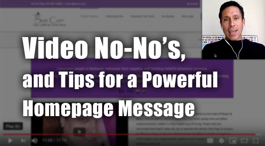
Coaching Website Review – Life Coach Sue
Here’s a quick website review for Sue Curr. Her life coaching website is at suecurr.com
Click here if the video doesn’t show.
As I create, review or enhance websites, I always keep this guiding question in mind, How can I make this website better for attracting clients?
Key points for Sue’s life coaching website:
- I recommend against having a video that automatically plays on the homepage
- Title the video saying what it is
- Your website is not secure. I am getting a not secure message in my chrome browser
- Its great that you have a message aimed at your clients. Its excellent and its at the homepage and at the top. Its a bit wordy, so cut it in half
- Bump up the text of the message in the purple box
- Good colors – purple and white space floating around
- When I click on a menu item in the homepage, it disappears in the next page
- Plus more …
When you hit the LIKE button, I get an electric jolt sent to my cell phone.
This quick shocker puts a smile on my face knowing that I’m helping someone ;). Thanks for that!

