Coaching Website Review – Life Coach Sathiya
Here’s a quick website review for Sathiya Ramakrishnan. His life coaching website is at smbhealth.com
Click here if the video doesn’t show.
As I create, review or enhance websites, I always keep this guiding question in mind, How can I make this website better for attracting clients?
Key points for Sathiya’s life coaching website:
- Put your business name, or yours along with the logo image. Otherwise it’s confusing. Being “cute” is ok when being cute doesn’t make the site confusing.
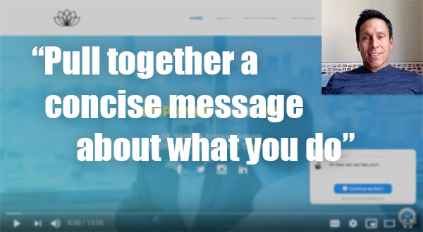
- It’s hard to know what your website is about and who it’s for. Start by getting the “professional” page list of struggles onto the home page into a concise statement of what you do. It took me a long time to figure out what you do, who you do it for, and why it’s important. This needs to be apparent within seconds.
- The pop signup list and chat box are annoying to me. They come up too soon as I was still trying to figure out what your website is about.
- If you’re going have your shirt collar flare out over your jacket, get a 70s shirt with a massive collar. Own it! ;P Just kidding – a test of humor.
- See the video for a few other grammatical hiccups and tweaks.
- Great photo of you btw.
- You seem like a person who is easy to talk to and personable.
When you hit the LIKE button, I get an electric jolt sent to my cell phone.
This quick shocker puts a smile on my face knowing that I’m helping someone ;). Thanks for that!

