Coaching Website Review – Recovery Coach Shane
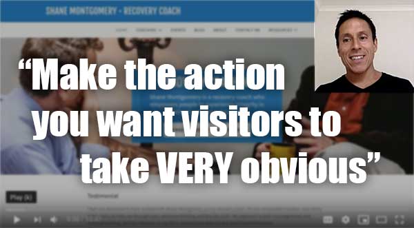
Here’s a quick website review for Shane Montgomery. His recovery coaching website is at augustinecoachinggroup.com
Click here if the video doesn’t show.
As I create, review or enhance websites, I always keep this guiding question in mind, How can I make this website better for attracting clients?
Key points for Shane’s recovery coaching website:
- It’s clean, and feels well organized, functional and complete. Very good!
- I like the central message, but I’d expand on it to include the situation or challenge that’s to be overcome or just below the top area into what I call “the story” section and get into what the challenges people are recovering from, being addictions, abuse of some sort or traumas. I’d list the top ones.
- You’ve got a great background image on the homepage. Really sets the stage for what’s here. Nailed it!
- The free session invitation is prominent, that’s great! But I suggest you expand on the page where you invite folks to request it. Sell it and talk about what kind of things they’ll get from that initial session. People will assume that it’s a sales call, which can be awkward, so promising to deliver real value is a good move.
- The domain name and website logo/id don’t match. Change the domain name to something like RecoveryCoachingWithShane.com or even ShaneMontgomery.com. Assuming there’s no reason that changing the domain name would be detrimental to perhaps search rankings or existing backlinks out there.
- Put your name next to your face.
Please do me a solid and hit LIKE.
It really makes my day to know I’m helping you. It’s like a little cyber cookie of feel good hormones that turn my computer face (often too serious) into a loving kindness look (better for my longevity).

