Coaching Website Review – Transformation Coach Jonathan
Here’s a quick website review for Jonathan Roman. His transformation coaching website is at sustainabletransformationcoaching.com
Click here if the video doesn’t show.
As I create, review or enhance websites, I always keep this guiding question in mind, How can I make this website better for attracting clients?
Key points for Jonathan’s transformation coaching website:
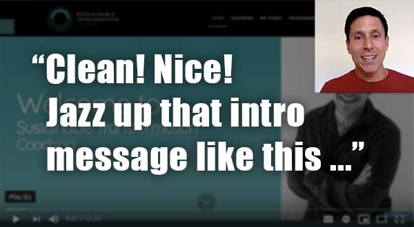
- Nice clean looking website. Your domain name matches your log and your menu is nicely positioned and small. Great!
- Great photo. Put your name under it, so we know it’s you.
- Pull the content near the bottom of your about page to the home page and replace “Welcome blah, blah, blah” with a juicy statement of what you do with people – making transformations permanent SO THAT juicy benefit, juicy benefit, juicy benefit.
- The black has strength and the teal shows some energy.
- A handful of other small tweaks and edits to make it smoother.
When you hit the LIKE button, I get an electric jolt sent to my cell phone.
This quick shocker puts a smile on my face knowing that I’m helping someone ;). Thanks for that!

