Executive Coach Andrea’s Website Tweak to Immediately Engage Visitors
Engagement. That’s the name of the game when it comes to coaching websites.
The sooner you can get them interested, curious, and excited, the better.
When they engage, they are more likely to take action, like reading an article, getting on your list, or calling you for coaching.
Here’s an engagement tweak for executive coach Andrea Wedell’s website.
One quick thing I LOVE about her website is the white background and the dark text.
It feels comfortable to look at and easy to read. Nice job there.
I’d make the font a tad bit darker to make it even easier to read.
See the darkness of font used on websites like LinkedIn, Google and Facebook or even your favorite bloggers.
To tweak it for engagement …
Instead of the current “Welcome to Andrea ….” on the home page, I’d put a juicy headline.
As it stands, she’s got very some tasty content on her bio page.
Specifically, this (copied and pasted from her site) …
“In her leadership coaching work she focuses on her client’s ability to build strong relationships with their teams, co-workers and clients. She helps them develop emotional intelligence and assertive communication skill to create strategic impact for both their organizations and themselves. Andrea’s clients report that she has an ability to connect with them on multiple levels almost immediately, she can quickly identify what their stumbling blocks are and how to best work through them. She also has a masterful way of cutting right through to the heart of the matter at hand and helping her clients find the best way forward.”
I would copy this right to the home page.
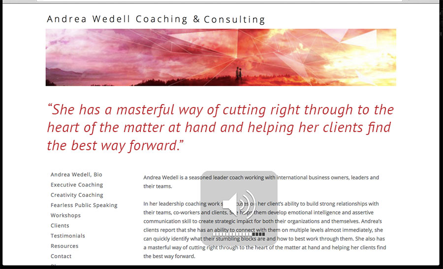
“She also has a masterful way of cutting right through to the heart of the matter at hand and helping her clients find the best way forward.”
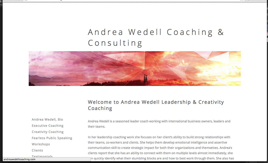
Here’s the BEFORE …
Notice the light body font, and there’s no engaging content without having to start digging.

Here’s the AFTER …
You can see the darker text and a big juicy headline while making the logo recede.

Remember, to engage visitors; we need to give them hope for big things to be gained. That begins right when they land within seconds.
In The Coaching Site Guide, a tightly packaged ebook, I give you my best secrets for engaging visitors with your website. In it, there’s a diagram called homepage attraction elements which shows you seven ways to get visitors engaged within seconds of landing on your site. Check out the guide here: The Coaching Site Guide.
Got a comment? I’d love to hear from you. Post below. 😉
