Four Heading Tips to Engage Readers in Your Freebie
Your freebie (free offer) is a key asset in your marketing as a coach. It’s the draw to get people to check you out – to give them a taste of your coaching greatness.
If you have a simple written document and are organizing the material so it’s easy to follow and engaging, readers will consume it whole. This is a great way to build your guru coach image.
Here are four tips for great headings.
1. Use fewer levels of headings.
Don’t have many styles for headings. It makes things harder to follow.
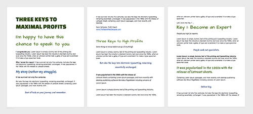
If you have many heading styles, you are probably over-organizing the content OR trying to emphasize too many things.
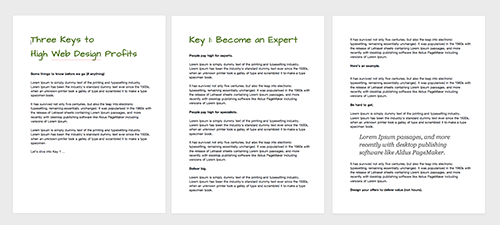
I recommend simply having one style of heading for the main sections of your freebie. The style should be obviously a heading.
Below: Too many headings, too often, too similar in sizes, too many colors, to messy!
Below: One obvious heading style that makes following along easy.
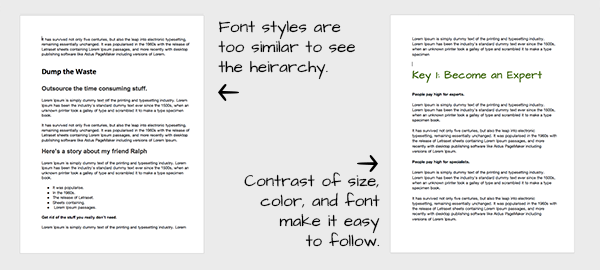
2. Use contrast.
Make sure that heading styles looks very different from the body font as well as the subheading. It makes it easier to follow.
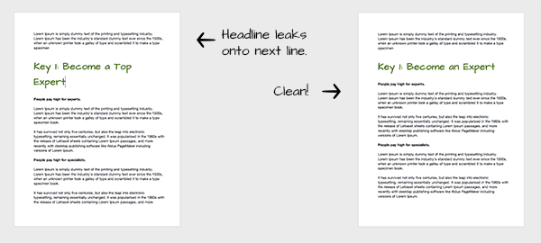
3. Don’t let your headings leak.
It looks awkward for your headings to leak over to the next line. It can also create confusion as you read the headings. Try rewriting the heading to fit nicely without losing the meaning.
4. Style your headings.
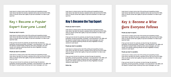
While the bulk of your writing will be in an easy to read, simpler font, the headings are a great place to add feel to your document. Use a style that supports the vibe you want to give off.
Relaxed and fun? Strong and serious? Natural, flowing?
In summary …
Your giveaway should be easy for readers to follow and appealing to look at. While some of this may seem like minor detail, ultimately this attention to detail lets people know they are in the presence of an expert!
Let me ask you …
Got any favorite formatting tips in your documents? Which of the above tips are helping you the most? Related thoughts? I’d love to hear from you. Comment below.

