Health Expert Website Design – Bold, Clear, and Content-Driven
I’m reviewing a dozen websites of coaches (executive, business, leadership) in my little stash of Nice Sites collected over the years. This one is Paul Saladino’s health expert coaching website with a “Bold, Clear and Content-Driven” vibe.
In this blog post:
- A quick look at the design
- My thoughts in a video review
- Three design tips from the video
What do you think of the design?
Tell me in the comments below.
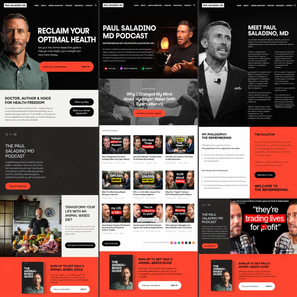
A screenshot for a quick look …
Paul Saladino’s health expert website is bold, clear, and content-driven.

Like it? I’d love to hear what you think in the comments section.
My Video Review for Design Ideas, Content Creation, and Tech Tips
In this review, I walk through what is working well, where the site feels a little light or dated in spots, and what coaches can learn from the way Paul stays visible and builds his world online.
A few quick tips from the video …
1. Conversion Tip. A free, valuable, immediately accessible DOWNLOAD (freebie) pairs nicely with continued helpful tips in the future by email (newsletter). This brings them into your world — your professional platform.
2. Trust-Building Tip. Your face, big, up front and center might feel weird to you. BUT, your visitors appreciate the transparency, the confidence, and the presence. You don’t have to have your face plastered everywhere, but you can’t be invisible either.
3. Lead-Gen Tip. One bit, obvious call-to-action gets more action than many, smaller, vague ones. Figure out the “user experience” you want that smoothly
leads them to becoming your client.
Watch full video here: Health Expert Coach Website Design for Fresh Ideas.
So wuddya think of this design? Share your reactions below.
I love hearing from coaches around the world. I actively watch comments, so feel free to post your website, questions, and thoughts. I await!