How to Design a Kick-Ass Cover for Your Freebie – Tip 1
In this article, I’m going to share the first of three of my best tips for designing a cover image for your freebie. It could be the difference between whether someone downloads it and becomes a client or just disappears from your site, never heard from again.
But first, quickly, the course, Build a Great Coaching Website, will be open for enrollment next week, Tuesday, February 16th thru Thursday. If you’ve been struggling to get online or you have a site that’s “fugly” or just not working, it might be time to sign up.
Students are using their websites to confidently market, grow their lists and generate free consultations. Learn more and get updates about the course here.
And now, back to today’s article – a kick-ass cover.
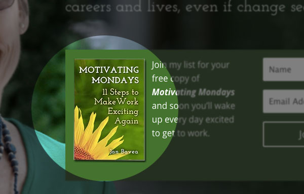
To make it clear, when I say “freebie”, what I’m referring to is the free report download as shown here on Jan’s site.
This freebie could be a CD, video, tip sheet or checklist; anything will do as long as it’s very easy to get and the content is valuable.
And as two quick reminders about why to have a great freebie …
- Your freebie is great for positioning you as an expert because it’s an official work, like a book. And clients love hiring expert coaches.
- Your freebie is a tool to help you attract people to your site (Hey, come get this free download!) and to get people to join your email list (Hey, join my list for this freebie!) – and as you you’ve heard over and over, your list is gold.
So, let’s say you’ve got a great title for your freebie, and you’ve written it up. Super!
Then, your next step is to make an awesome cover image for it so that it looks top-notch.
The first key of three keys to a great visual is …
Freebie Design Key 1 – The title MUST be extremely easy to read to entice people to want it.
Often, I see sloppy design where the freebie cover is just unreadable due to poor font choice, bad word positioning, or an overcomplicated layout.
Here are a handful of examples of hard-to-read titles …
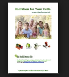


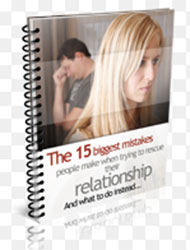


Were you able to pick out why they are hard to read?
Many have small fonts, so the design wasn’t adaptable to smaller sizes – very common.
Some just use too many fonts, some use too light of a color, and some have huge images that crowd the page.
All are tough to read.
You need to choose fonts, colors, and a layout that makes the title incredibly easy to read.
And it’s vital that the image looks good at smaller sizes, not just for use on your site but also for places like LinkedIn profiles and viewing on mobile devices.
In the Great Website Course, students get tutorials, examples, online tools as well as feedback from me and other coaches to make sure their freebie cover image is easy to read and looks grand.
Here’s a harsh reality -> your potential clients are checking you out online, and there are so many other coaches and options out there to overcome their challenges. Your freebie is such a great, non-salesy way to invite people to learn about what you do. Just say, “Hey, come download my freebie at my website to help you make changes and overcome challenges.”
And once they do, you’ll create a positive image in their minds and you’ll be in touch in a positive way. A sweet win-win. That’s how you attract clients.
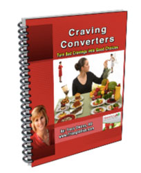
Here are some great covers that are super easy to read …


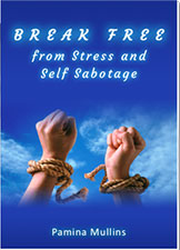

So, make sure you create a great freebie with an extremely easy-to-read title – else they might just miss it. Yipes!
In two days, I’ll post the second design tip for creating a great-looking freebie.
In the meantime, have you created a freebie? How did the design go? Does it look good at small sizes? If you have created a freebie, how about you post a link to your website?
Why have you used 3D generated images for the “poor” examples and front on 2D images for the good ones.
Surely this is an unfair bias.
Those were the ones that showed up on a search. 😉
The 2D ones, I made for clients. Ease of use, readable, speedy to create and still look fresh.