How to Ensure No One Reads Your Website
If you didn’t know, I’m a bit of a health nut – or cooler, a bio hacker. I love finding those hidden gems that make us healthier and life more enjoyable.
And in some research, I ran across a nice article on sleep waves. But even as much as I wanted to dig in … I just had to run for my life because of the body font.

Click on this article, Physiology of Sleep (it will open in a new window) and start reading and I’ll see you back here in about 1 second flat as you flee for your life.
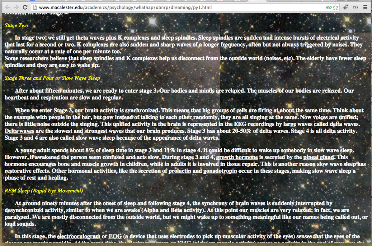
Here’s a screenshot of it …

So, why was that page near impossible to read?
Why would you rather pull your own teeth than sit in front of that page?
I’ll give you a big hint … How is that page different than an article from your favorite blogger? Or even this article you’re reading right now?
Or this article, how to hack your sleep from one of my fitness gurus, Ben Greenfield.
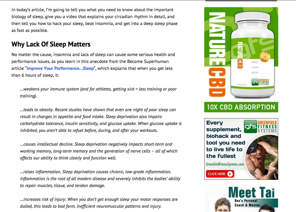
Here’s a screenshot …

Can you tell the differences?
Why is the first article above a total nightmare to read while Ben’s article is like a sweet dream?
Here are the answers …
1. Intricate backgrounds.
That first article is tough to read because it’s got a busy background.
It’s both high in detail and high in contrast and it swallows up the text.
Ben’s article is simply dark text on a light background. Perfect!
2. Bolding everything.
We are accustomed to reading a certain thickness when it comes to copy.
The first article’s text is all bolded which is uncomfortable.
The fact that it’s also white makes it feel even bolder and it starts to become a big blur.
Ben’s article has a font that’s a normal, comfortable in thickness. Nice.
3. Text that spans the entire browser width.
When text spans the entire browser width, particularly on a laptop, the sentences are pulled wide and it forces us to move great distances to read.
We’re not use to it and it becomes easy to lose your place as you journey back to the next line.
On phones and pads, this will be less of an issue as those devices have smaller widths.
Ben’s article has short widths and short paragraphs, fast and easy to consume like popcorn at the movies. Yum!
Did you guess those three things? Two of them?
Great! You’re becoming a guru.
Remember, the more they read, the more they see you as a great coach.
In short, heed these:
- Be sure to stick to a font that’s easy on the eyes.
- Go for dark text on a light background.
- Avoid noisy backgrounds.
- Go for smaller chunks of text.
- Consider your favorite bloggers and see what they do.
Be sure you’re not giving them recurring nightmares when they think about your website – and instead, they’re reading your every word, and dreaming of great futures.


There is probably a setting in the theme.
If you’re not technically able to figure it out, ask the theme company.
If you still struggle, see if there’s a fiverr person who is good with css.
Those should do the trick AYyugen.
I think am already following most of your guidelnes…
But can you please help me understand how to darken the basic typeface built into my theme..I was told the problem was a CSS issue…?? And upgrading probably won’t give me this automatically from what I’ve learned. Do people really enjoy looking at faded-gray typeface?
I’m lost. How can I darken the basic text without switching to another theme and this one is the best I have found after looking at 50.
There is nevertheless some great advice here.
Thanks in advance ;=)
Avera Yugen