How to Get People on Your List – A Before and After Example
A great freebie will do three amazing things for helping you get clients. (1) It will bring traffic to your site (Hey! I gotta get that freebie!). (2) It will get people onto your list (Sure! I’ll add my name for that fabulous giveaway!). (3) It will boost your status as an expert (Nice! This coach really knows her stuff!).
Just think, a free report titled, 5 Food Tips for a Highly Energetic Day, assuming you’re struggling with low energy and low productivity, will get you to come to the site, download the report, and read it right away.
However, the trick to making sure this freebie strategy is well implemented is to make sure your invitation to get the freebie is easy and enticing.
In this article, I will share with you before-and-after images showing how to make your freebie attractive for people to get.
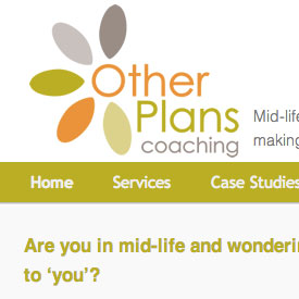
A quick thanks to Sally Branch, life coach to those in mid-life who have lost their dreams, for sharing her site as a before-after example. Thanks Sally!
Before

Sally’s got a nice site. It has easy-to-read copy, a great headshot, and copy geared to her market. Nice work! However, her freebie, while very prominent on her page (good!), could use some reworking.
Three challenges with the freebie:
- It isn’t being sold very well. It would better if the benefits were highlighted right on the home page. Growing your list is very important.
- To get it you must click to a separate page. It isn’t obvious that this invite is actually a button – some people won’t click it. Also, every extra click can result in a tech failure. Generally speaking on the web, less is more.
- The invitation to get the guide would be more attractive with a visual.
After: To improve it, I modified the invitation. Here’s a screenshot:

As you can see, the freebie offer has been revised:
- There benefits are clearly stated, making it more desirable.
- The visual adds more value and grabs the eye.
- The signup box is right on the homepage, prominent, and easy to use.
Caveat
My suggestions are based on what works on the web from my experience and experience from other experts. They are good rules to follow.
BUT, the proof is in the pudding. The only real way to know if my suggestions will improve her site is to track numbers. Tracking the rate at which visitors sign up for her list would be a key measure.
In summary
In summary, if you’re going to incorporate a free giveaway on your site, make it easy to get and highlight the benefits. The bigger you can grow your list, the more clients you get.
Let me ask you
Do you have a freebie? Is it prominent on your site? How can you get it to be more attractive to visitors? What key benefits can you highlight on it?
I’d love to hear from you! Comment below.
Kenn, thank you again for your tips. I’m studying and trying to practice them. Still a long road for me to travel, but I realize I need lots of advice! I hope you’ll write something on promoting books.
HI Kenn – Great post, as usual. Always enjoy your tips and tricks. I’m actually current working on changing my offering right now to get more people on my email list. I think it’s important to let people know that you are also subscribing them to a weekly (or however often) newsletter and not just providing them with the free guide. Thoughts?