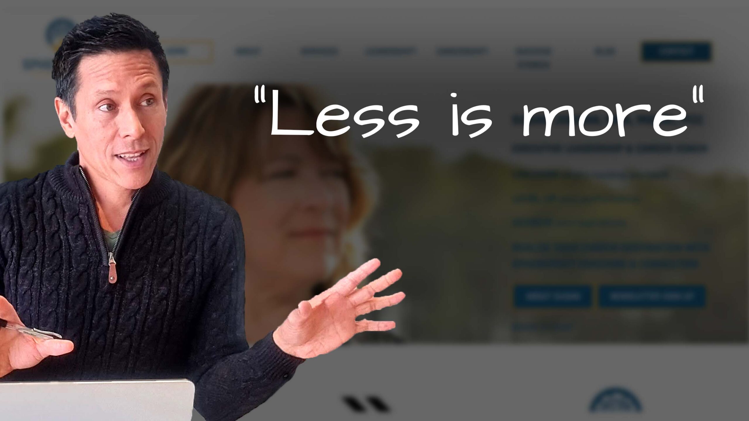
“Less is more”
In this website review for leadership coach Susan, I share ideas to improve her website.
My initial reactions are positive, but there are a few suggestions.
* The pop-up for joining the email list can be a bit overwhelming, so consider making it less intrusive.
* Ensure your homepage text is more readable with a lighter background or gradient behind it.
* Also, focus on clear calls to action, like coaching services and testimonials.
* Consider having a separate page for testimonials to make them more prominent.
Overall, your unique qualities, like a relaxed and humorous style, stand out.
Want me to review your website? Just comment below to give me your link, and I’ll add it to my list.

