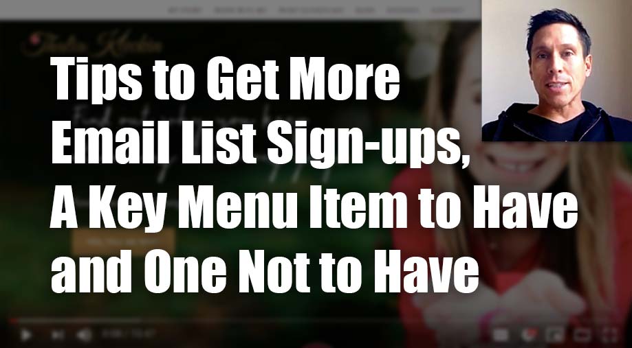
Love Coaching Website Review – Thalia
In this video, I review Thalia Kleckin’s love coaching website at thaliakleckin.com.
Click here to watch this website review on YouTube.
Many more website revives over at CoachingSitesThatWork on YouTube.
If you would like to schedule some quality time with me to improve your coaching website, just contact me here.
As I create, review or enhance websites, I always keep this guiding question in mind, How can I make this website better for attracting clients?
Key points for Thalia’s love coaching website:
- Like that your face is up front and center. It’s good to be present on your website. You look excited too. Good!
- Your logo and domain name match so I know I’m in the right place.
- The menu is simple and the labels are very easy to understand. Superb!
- The first thing I’d improve is to reduce the number of steps to get on your list for the freebie. The home button is sending me to another page. Just put the form right on the home page. There are 3 different ways you’re mentioning it and it’s confusing me as to what’s what.
- Secondly, add a link in the menu that says “home”, especially because your logo isn’t part of the menu.
- Lastly, remove the extra submenu item for the Work WIth Me page. Better yet, just call it “The Love Program” or “Love Program” which is what you’re offering.
- Good energy and client-focused material on your site. Nice.
Please do me a solid and hit LIKE.
It really makes my day to know I’m helping you. It’s like a little cyber cookie of feel good hormones that turn my computer face (often too serious) into a loving kindness look (better for my longevity).

