
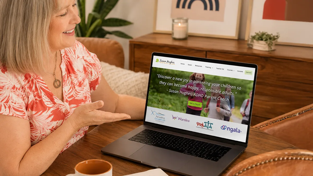
She Avoided the MESSAGING MISTAKE Most Make — ADHD Coaching Website

Have you ever landed on a coaching site, skimmed it for a few seconds, and felt… nothing? No spark, no hope, no “hey, that’s me.” That’s what weak words cost you, and it’s not just a visitor, it’s someone who was ready to be helped.
So let me share some insights on a coach’s website design that shows you a better way for messaging.
I designed Susan’s site a few years back. She’s an ADHD coach over in Perth, Australia. My approach began with a close look at her clients and her experience so that we could create content that would get visitors excited about hiring Susan.
Here’s a quick look at it …
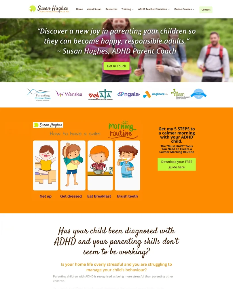
The mistake many coaches make is writing about “coaching.”
The easy thing to do, which isn’t the best, is to talk about sessions, assessments, and trying to explain things like “this isn’t therapy.” While true, these points don’t hit home with your visitors.
For Susan’s visitors, they’re tired parents scrolling at night for help. They aren’t shopping for a method, they’re shopping for relief as they raise kids with ADHD.
Coach Websites GOTTA Speak The Client’s Language. So we did that on her website.
I’d spend less content talking about your role as a coach, and more time talking about your client’s life, the before and the after, in real, felt words. Paint the dream, not the problem.
Susan’s site does it well, here are 3 places it works well.
1. It made her homepage inspiring.
She could have opened with her title, but instead she wrote: “Discover a new joy in parenting your children so they can become happy, responsible adults.” That’s not a job title, that’s a dream, and there’s a big difference.
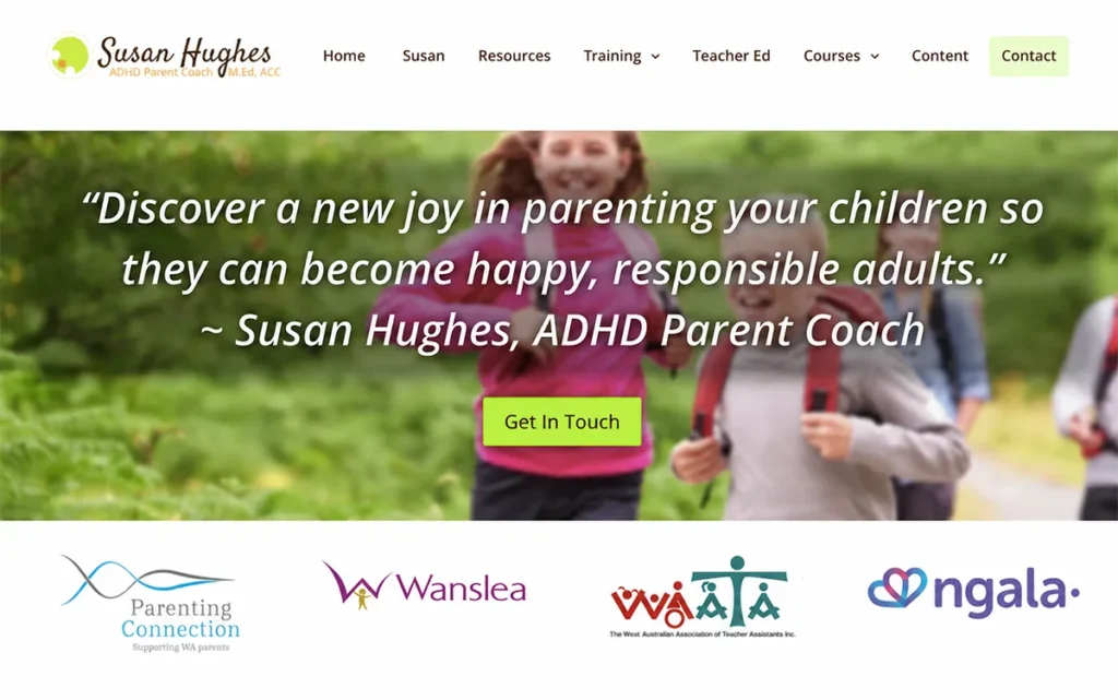
2. It made her Freebie irresistible
Susan’s freebie isn’t a big, boring PDF, it’s 5 Steps to a Calmer Morning — small and sharp, fixing one real pain today. A narrow freebie works like magic, while a broad one just sits there, unread.
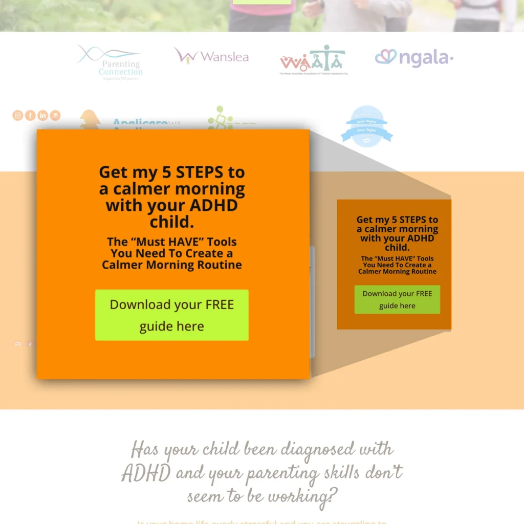
3. Her write-up sounds amazing!
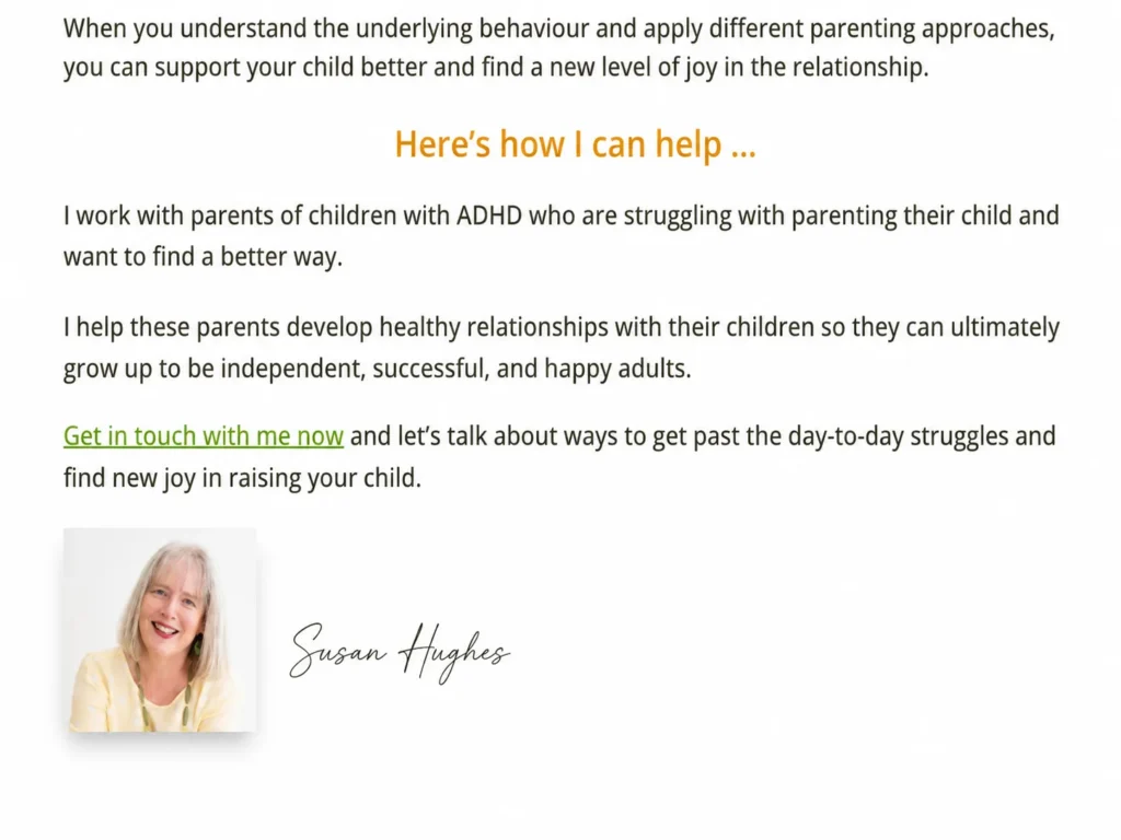
Her “how I help” section says it plainly:
“I work with parents of children with ADHD who are struggling with parenting their child and want to find a better way. I help these parents develop healthy relationships with their children so they can ultimately grow up to be independent, successful, and happy adults.”
Notice what’s missing — no sessions, no tools, just the parent’s story. Susan is the guide, and the client is the hero.
Want to make EVERYTHING exciting on your website?
The Coaching Website Guide, 20 years of notes, helps you figure out the content, design, and structure so your website WOWs your visitors. Hundreds of coaches love it.
The lesson for every coach
You’re not selling your method, you’re selling support for pain riddance, change making, and goal attainment. It’s all about the language, stories, and thoughts in your client’s head.
Was this helpful? Tell me below.
What are you taking away from this article? I’d love to hear from you.
Kenn, POWERFUL POST✨ In my eyes, this might be one of your most powerful posts yet. The distinction you make here, is absolutely SPOT ON! Your website visitors aren’t shopping for a method (describing coaching or how your method works) – the website visitor is shopping for relief.
💡 Speaking the client’s language is the difference between a site that feels alive and one that feels like a brochure.
I do slightly diverge on one point: “paint the dream, not the problem.” I’ve found that the highest‑converting coaching sites do both — they articulate primarily the problem with such clarity that the reader feels deeply understood, and then paint the relief – the possibility, the after. When you alternate those two — the pain and the promise — you create emotional resonance and forward momentum.
Still, the core message here is gold: less “here’s how coaching works,” more “here’s what your life can look like.” This is the maker‑or‑breaker of coaching websites, and Susan’s site is a masterclass in getting it right.
Congrats on helping – what is it, 100+ (?) – coaches in building similarly powerful websites!
Oh man, over 100 sites, but like over 1000 consults, enhancements, redesigns, course students … I suppose I can add book buyers somewhere in the mix. And then there are those viral “Post Your Website for Feedback” discussions in our group. One went over a year
Solid lesson to make the Freebie irresistible. I don’t think I’m there yet. But it’s an aspiration to tackle!
This really resonated, Kenn. I often see coaches trying to explain everything they do, when a simpler message would probably connect much faster with the right people.
Have you found that it’s harder for experienced coaches to simplify their message because they have so much they could say?
I haven’t found it harder for experienced coaches to simplify their message compared to newer coaches. I had to think about that. Most of the coaches I end up working with appreciate feedback on their message, often making it simpler, clearer, and closer to what their clients are thinking and feeling.
Thanks for sharing this article, Kenn. It’s all too easy to write for ourselves instead of the person we’re trying to help. I see the same thing in leadership and productivity coaching. When we’re too close to our own expertise, we often overcomplicate things. Clear thinking leads to clear communication, and clear communication makes it much easier for people to recognise how you can help them
Hi Wendy, thanks for popping in. Love your stuff on LinkedIn. And nice to hear the leadership folks struggle with it as well.
Bingo! I always tell my clients…people don’t buy coaching. They buy the transformation your offer promises. You do have to paint the pain in aspirational opposites. Calmer mornings is the opposite of the chaotic mornings they are used to. Do you believe pain based messaging works better than aspirational messaging?
Such a good question. I’ve seen both at play. I’ve seen both get traction.
I generally like to get all the emotions going, for a double wow.
If I had to choose one? For articles, maybe I’d do the negative.
For website homepages, mostly positive at the top.
For program sales pages, all of it every which way.
So, situational. Test stuff out.
I’m curious what you’d say Lori? ALways great to have your thoughts, brand magician!
Was there a deliberate choice to focus on the client’s dream vs the problem? The language, colors & freebie strike an optimistic tone. Do you recommend this focus or could a website be as effective by focusing on the client’s problems?
I think you can and should do both. You do need to let the person reading know that you understand them deeply. Sometimes just aspirational messaging by itself doesn’t reach the person who doesn’t feel understood or even believe change is possible.
For a homepage hero, I’d definitely have the positive in there.
But like Lori said, both are emotionally powerful.
I’ve done stuff like, “Go from feeling helpless and defeated to empowered and motivated about your life goals.” ~ Accountability Coach.
A way to bring in both.