
New Coaching Website Redesign for Cora
Today, we declared transformation coach Cora Whittington’s website redesign “live.” It’s at https://coachcora.ca (the link opens in a new tab). Below are details about the project, Cora’s feedback, and before-and-after pics.
I first met Cora over 10 years ago when we built her first website to grow her coaching business. She’s a life/career coach who helps people transform on the inside, and their success naturally follows.
It’s been a while, but we’ve been in touch over the years, and her site had gone some changes over that time, edits by her team as her businesses evolved.
About a month ago, she reached out to me for help.
She saw a slow down in leads to her business, and it was time to put energy and focus on her marketing again. Having active coaching clients is important to Cora. It’s her gift, and giving it to the world keeps her at her best.
As you know, it’s an honor to work with people like Cora. Dynamic, intuitive, positive, and productive. The people I spend time with are a big part of why I love this web work.
Key reasons for the redesign:
- The site was getting painfully slow from shared hosting, too many plugins, a clunky theme, and having too many sites on her plan, even though she hired many developers to help speed it up — it was clocking near 10 seconds to load.
- The existing design was too complicated. When asking her clients and others, the message was clear — make it simpler.
- It was riddled with tech issues, including dead image, links to wrong pages, broken links, and forms and email not working.
- The colors and images no longer reflected the visual brand and level of professionalism that Cora brings — 20 years of coaching, training, and facilitating.
- There was a lot of old stuff that needed to be removed — housecleaning for short.
So, needless to say, I was excited about another stretch of creative fun work together.
The ReDesign Game Plan
One oughta go into a website revamp with a clear list o improvements to make. For Cora’s site, the top three things were:
- To make the site run fast. So we need to get better tech in place and clean out the cobwebs – more like caked-on code and sticky scripts.
- Make the layout simpler. We were to get rid of lots of doodads and whatchamacallits — the bells and whistles that made things confusing.
- Focus on her one-to-one coaching — in this remote covid world that we’re moping through.
While we were in the throws of retooling things, we did take a quick detour to get clear about her visual vibe — to make sure the color, logo, images, and shapy things both felt good to her and worked well together.
Ultimately, we took a step in the direction of the magician archetype and steered the words and images in that direction. I called it the magic in nature.
I’m no branding maven, but I’ve discovered that things (colors, words, fonts, visuals) when they align with the feelings you want visitors to have at your website.
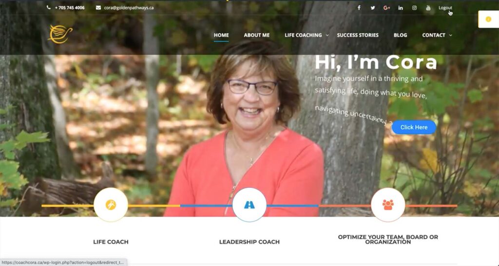
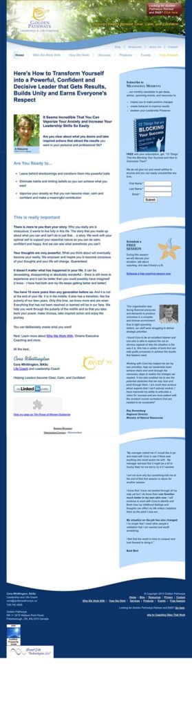
Before Image
Here’s a screenshot of the homepage. She’s got great energy about her, though the website is quite busy, and dark in some spots. You can’t see the clunkiness and slowness — I’ll do “before videos” in the future.
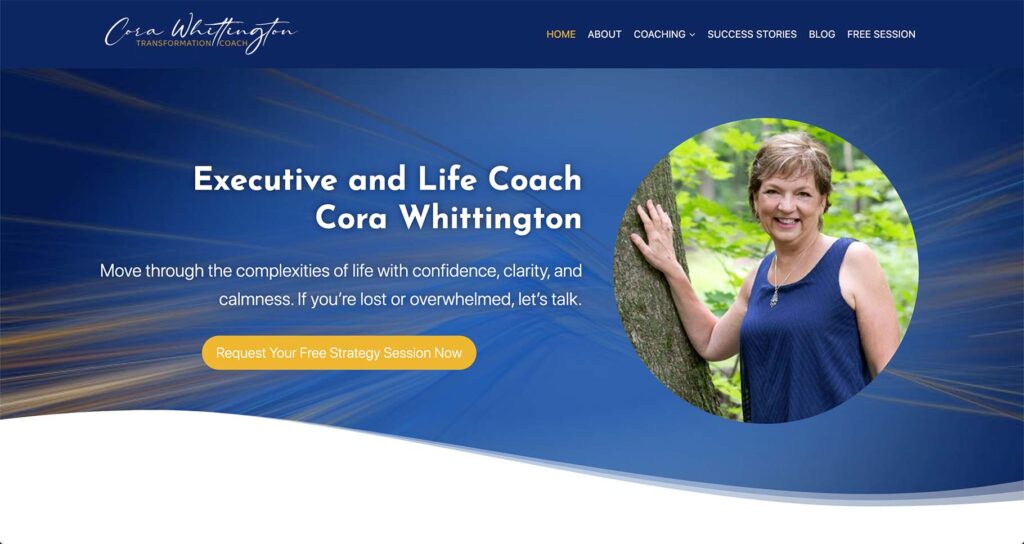
After Image
Here’s the top section of the new homepage of her website, https://coachcora.ca (the link opens in a new tab), and below is a full homepage glance.
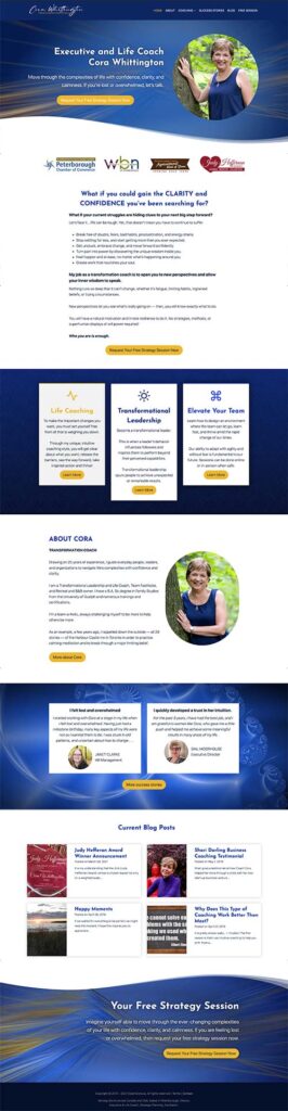
Here’s a zoomed-out glance of the homepage in full to get a feel for the various sections. But you should visit her website (the link opens in a new tab) to see it in real-time.
We also redid her logo to bring that personal human touch.
As you know, clients want coaches they trust. They love coaches who are good listeners, fully present. It’s human. It’s helpful, precious, and rare.
And online, when it comes to your website, marketing, and interactions, the same holds — we love “feeling” others through our posts, conversations, and texts.
We decided to go with that natural feeling, and we used a handwriting font in her logo. You can be the judge if it hit the mark or not — post a comment below.
Here was the previous logo — which is more of an icon or visual representation. She used this as an integral part of her event space/retreat which offered coaching and facilitation, pre covid.
And here’s the new one, which is a black/gold version of the one in the website above. For different purposes (biz card, website, email) one would need slight variations.
Digging it?
I’d love to hear what you think in the comments below.
TIP: When it comes to your website, visuals, content, and all efforts along the way to find clients, I’ve found that being present, warm-blooded, and authentic is the move to make.
Kenn Quote
It’s much better than any sales trickery, forced tactic, spammy posts, or messages that just feel icky. It beats any attempt to look like a big company too.
For giggles, let’s go way back …
Here’s the first website that I designed for her way back in 2012.
Back in the day, computer screens were more square than landscape. Reminiscing, the designs have evolved, but the marketing strategy (can you spot it?) behind it still holds strong.
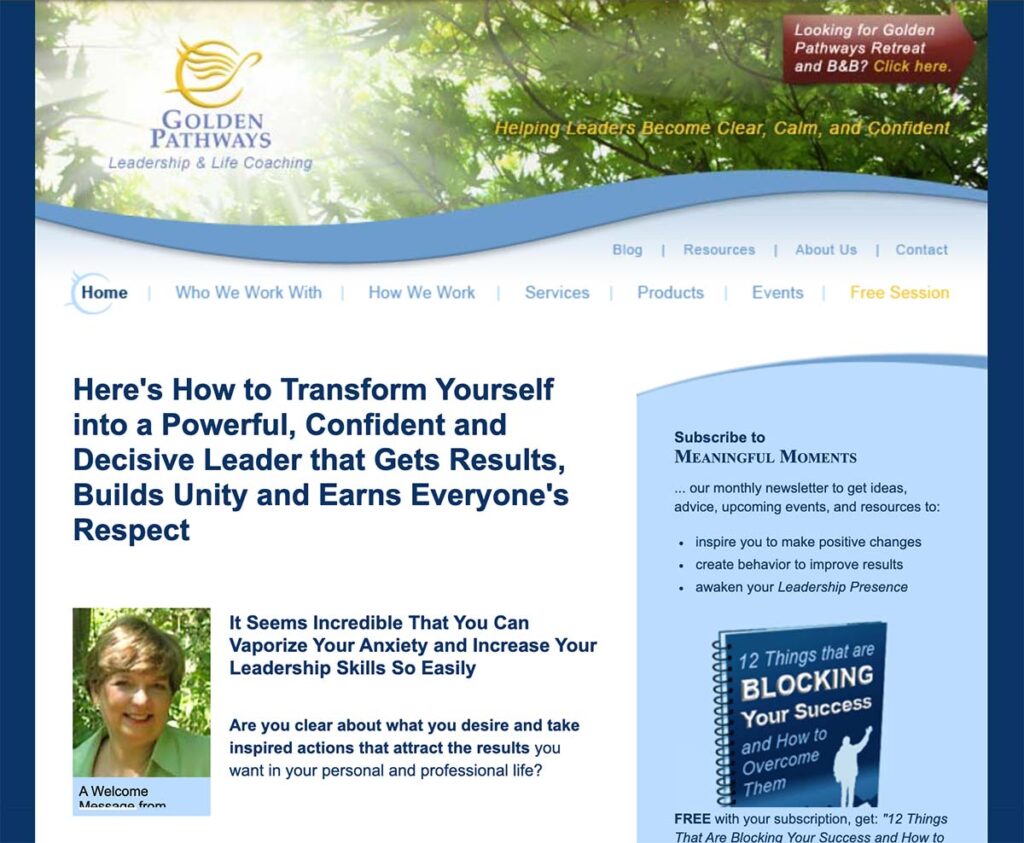
And here’s the homepage zoomed-out so you can see it in full.
What Cora said about our work …

I have had several sites over the past years, and for the last website, I used a “Coaching” template.” I found that it had too many features, distracting elements and was slow and sluggish. I had to spend tons of time figuring out how to lay it out and what looks to choose and fix things to make it run faster.
This time you just made it happen, and I could focus on content. I’m the kind of person who needs to see it unfold to know what works. You took the initial draft (which wasn’t resonating), discussed it with me, and worked your magic into a look that my colleagues and I love. It is also very custom-looking because the design elements you created are unique and not found in a template. For example, I asked for “fractals” to be incorporated with a down-to-earth approach, and you nailed it.
You helped me with copy, and that was tremendous. You helped me “let go” of words and pages that I have used for years to simplify and be more impactful. You tightened content, fix errors, and got me into Grammarly. You made word suggestions, and that help was excellent.
I’m thrilled that the site is running very fast. You minimized the number of plugins to only essentials, which will make it more secure (a problem that I had in the past).
The most critical outcome for my site is to attract clients.
I know that you have been studying the formula for years, and it was great to implement it versus figuring out the current trends yet again.
The 2-week schedule you offered was perfect for me. The fast responses by emails and timely calls were perfect for getting the job done.
The whole process was energizing and helped me focus on my business. When I do, new opportunities start to show up. Recently, a past client got in touch with me.
Thank you, Kenn, for helping me create a magnetic site that will attract the perfect clients for years.
Hi Kenn & Cora,
The colour background, setting and features are very good.
This highlights a professional site and will attract interest and clients.
The main point too, is that it is easy to navigate a big plus, a cheerful happy site, excellent.
Her new site is a whole different world and I believe she’s so well represented. It’s light, lovely, and I think it’s very clear right from the outset what she does and who she serves. Love the new site! Great job.