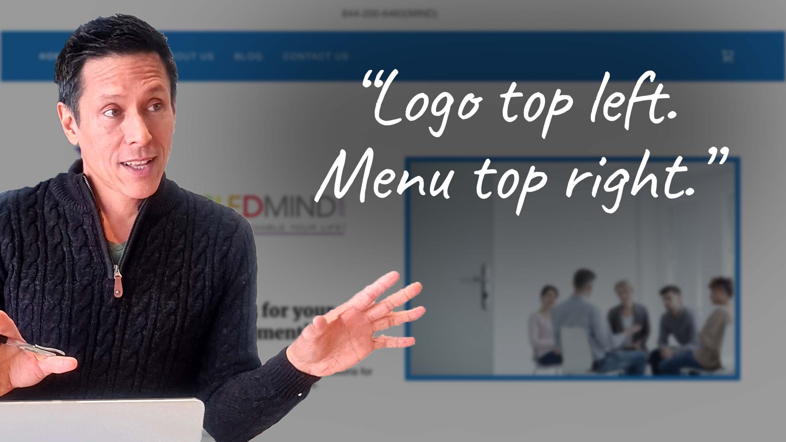
Personal Development Coach – Logo and Menu Positioning
In this website review for personal development coach Travis, I share design, content, and tech tips.
I like the neat logo and simple menu.
To improve it, I talk about the following:
- Optimal positioning of menu items and logo.
- Font colors and sizes for readability.
- Vital content to put on the menu.
- Website speed and performance.
It is a work in progress, so hopefully, these ideas will lead him to a great website.
For reference, his personal development coaching website is here: https://enabledmind.com/.

