Tips for Coaching Website Taglines from My Local Broadband Provider
Chorus is a local broadband service provider here in Auckland, New Zealand.
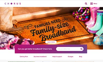
As you can see, their homepage opens with a big image of a doormat with a message – not exactly a tagline, but it hits home.
I LOVE THIS!
For many reasons:
- It’s targeted to families, their market
- It’s got subtle cues – kids booties, doormat, front of the house – welcome to our home with great wifi
- It evokes a powerful feeling of a happy home (because of good internet speeds)
- It’s a big hero image and a simple, obvious message
- the main color for Chorus is purple, and the image matches it (or has been tweaked to do so)
For coaching websites:
- What image would make your ideal client feel “right at home”?
- What is the ultimate big benefit your best clients are after? What do they truly want?
- How can you express the big benefit in simple yet powerful terms?
Again, LOVE THIS!

