Website Glow-Up for Wellness Coach Alexis
Most coaching websites lose people in the first few seconds. If a visitor can’t quickly see what you do and who you help, they click away — and you lose the chance to earn their trust.
Alexis Nizzero, a holistic wellness coach for women, has a clean design foundation, but the homepage’s top section isn’t working as hard as it could. In this post, you’ll see my gut reactions, the before-and-after redesign, and the key lessons you can apply to your own site.
Below are:
- My Gut Reactions
- The BEFORE Screenshot
- The AFTER Redesign
- The BIG Reveal
- Two Takeaways
Enjoy!
1. My Gut Reactions
What I like about her website:
- I like that the logo at the top clearly says Alexis Nizzero Coaching, and that it matches her domain name. It’s smooth consistency.
- She also has a few warm, friendly images of herself. Great!
- Her writing feels natural and supportive — like I’m hearing directly from her. And it’s full of client benefits. Nice job!
Key things I’d improve are:
- Rework the header area (logo, menu) to take up less space, allowing for more room for a powerful message and her photo.
- Design the hero sections so the message is stronger, so her warmth comes through in her photo, and it’s clear where to begin.
- Enhance the book-a-call feature so it’s more prominent and has more detail to help the visitor take action.
See my Gut Reactions YouTube video for a deeper dive into Alexis’s wellness coaching website.
Here’s the glow-up …
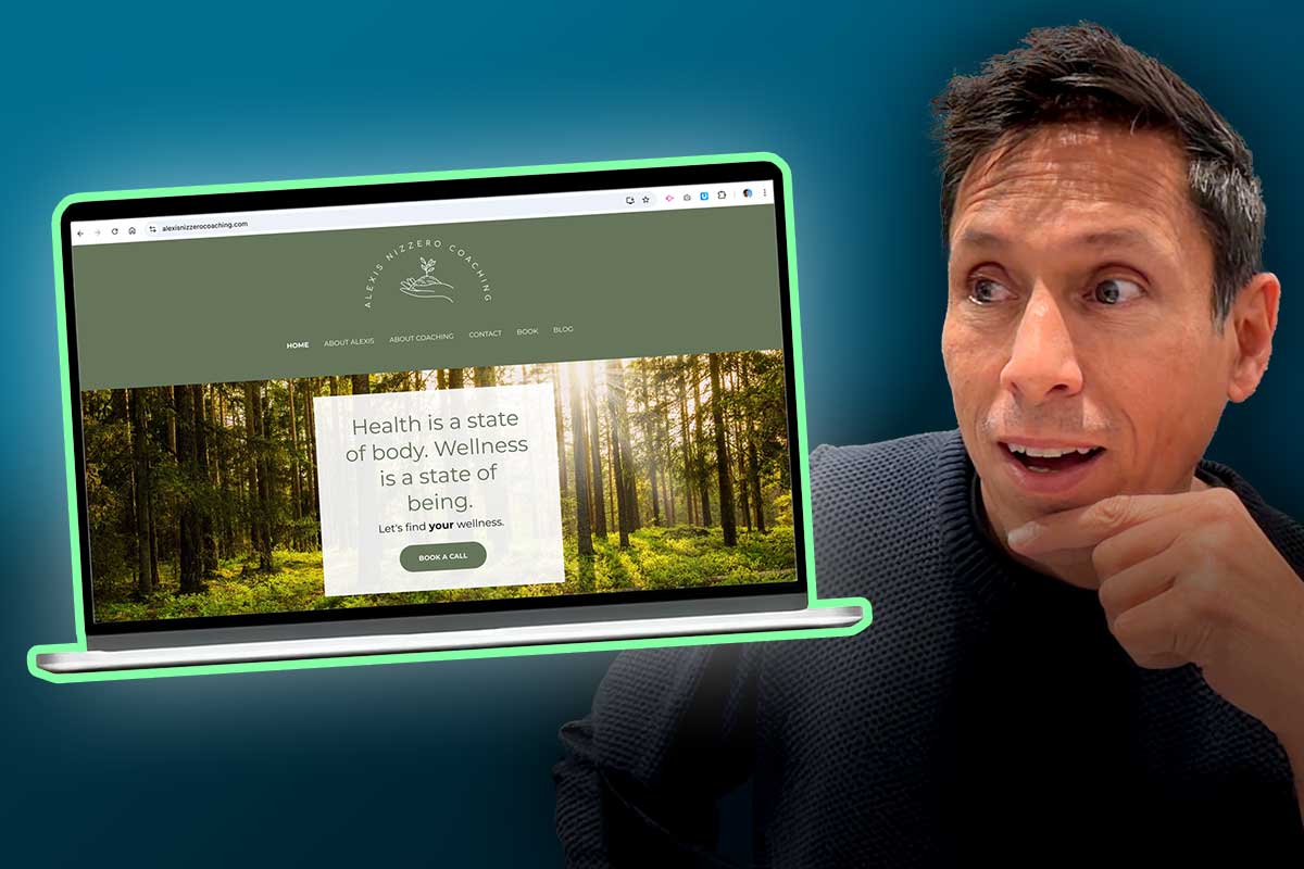
2. The BEFORE Screenshot
This is an image of the top of her homepage (MacBook Air, Chrome). This is “above the fold” — what you see before you start scrolling.
3. The AFTER Redesign
After much tinkering and toiling, review of copy, some color play, and Photoshop magic, here’s my revision.

Wuddya think? Like or dislike? Got ideas to improve? I’d love to know.
Tell me in the comments below.
4. The BIG Reveal – Does she like it?
Here are clips from our follow-up chat — ideas to apply and attract more clients.
5. Two Key Takeaways
#1. Show up big for your clients, right at the top of the homepage. Visitors (people who have struggles and need a coach) want to find the perfect coach for them. And they will wonder who you are and what you look like. You might as well build that connection instantly at the start. Trust is vital.
#2. Create a compelling message at the top, so people instantly know they should stick around. If the first bit of copy doesn’t speak directly to your visitor’s pain or desire in the first few seconds, you’ll likely lose them. Coaching is for big, good reasons, and you should highlight that for visitors right away.
Want to see more Glow-Ups?
Join my email list Website Insights where I share redesigns, traffic-building tips, and simple ways to make your coaching site work harder for you.
The after website design is so much clearer and it’s nice to see who you’d be working with. Great insights and design.
Your glow up looks nice! I love that image of Alexis. Very inviting – so much better than the original. Reminds me I need to design a hero section like that on my website 😉
Love the changes to Alexis’ website, particularly the prominence of the picture next to the book your “Thrive Call.” Now, I want to rename my button with a catchier name than Exploratory Call. Good food for thought!
Yeahhh …
Get Your “Empower My Life” Session.
😛
Great stuff, Kenn.
That is definitely a substantial improvement.
A further thought – the site feels to me to be too green/monochrome (a bit drab)?
Adding the pink Action Button does help a tiny bit, and makes the button even more of a focus point on the page, which is very good. But, that almost accentuates the “too green” feel.
Alexis comes across as a lady of action, so I suspect that a more dynamic color scheme for the site may suit her personality better …?
Hey Alan.
Yeah, I think the pink and green is better, and after a call with Alexis … I think we’re gonna move in that direction, depending on how her new photos turn out. Thanks for chiming in.