Homepage Glow-Up for Trauma Coach Deneen
The bounce rate refers to when people “bounce off” your website. Lots of coaches’ websites lose visitors in seconds because their homepages fail to engage upon arrival. We want to avoid that 😉
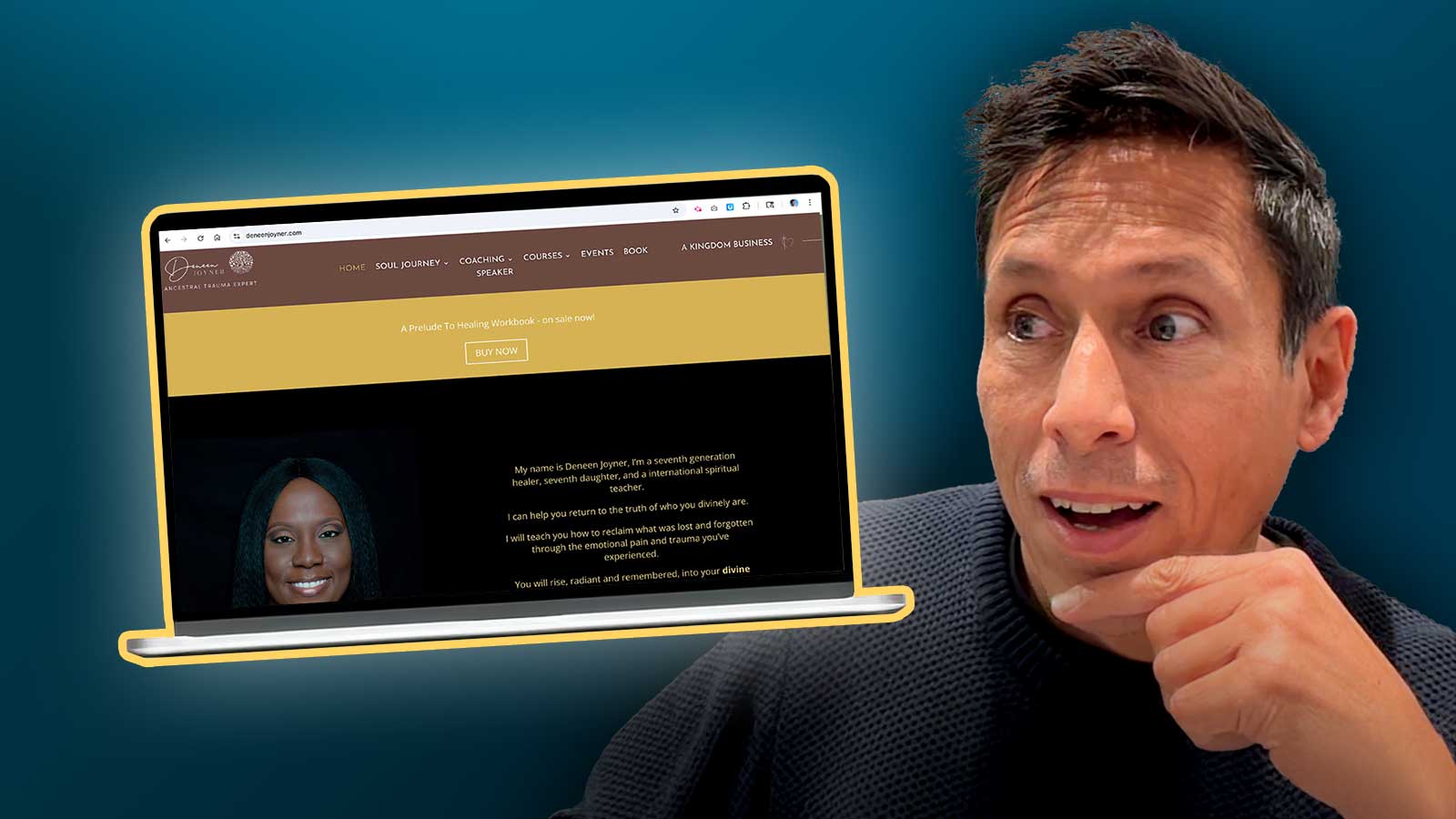
Deneen Joyner is an ancestral trauma coach (DeneenJoyner.com). Her work is powerful, but her homepage wasn’t showing it. So I rolled up my sleeves, fired up Photoshop, and gave it a little glow.
Below:
- My Gut Reactions
- The BEFORE screenshot
- The AFTER glow-up image
Enjoy!
My Gut Reactions Video
Here’s my quick-fire take on Deneen’s site: what’s working, what’s not, and initial ideas to improve it.

My first impressions (30 minutes)
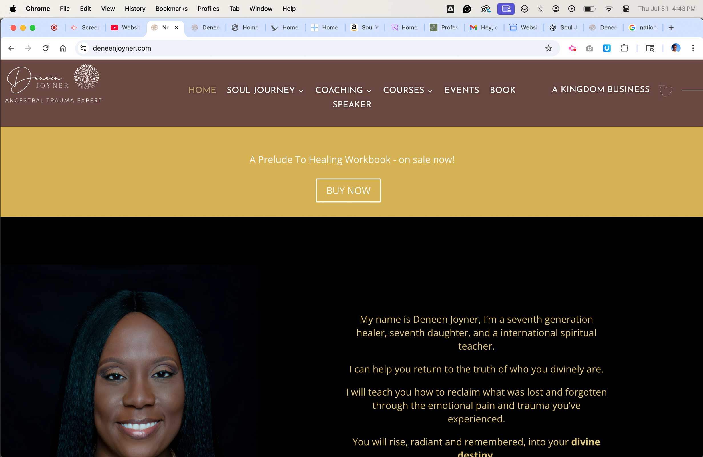
The BEFORE homepage
I loved the visuals and color, and her personality comes through nicely around the site. I can get a feel for who she is, which I like.
To have more impact right away, I want to tweak these items:
- Get a powerful message with her face instead of lots of tiny text.
- Tidy the header area to make it clearer, simpler, and more intuitive.
- Make it clear where the most important place is to begin.
Here’s the homepage top area (MacBook Air, Chrome). Click to enlarge.
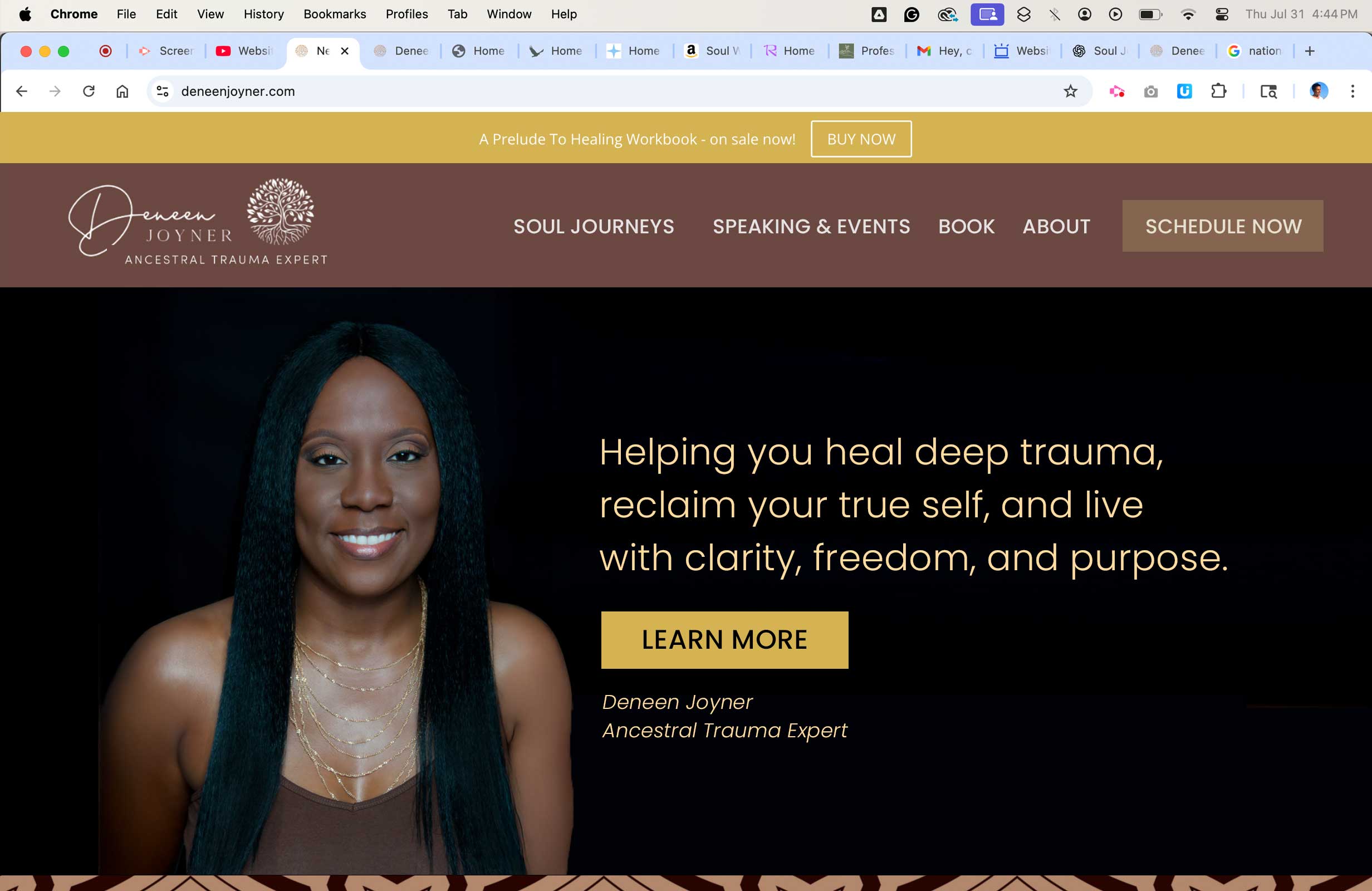
The AFTER image, glowed up!
I’ll let you decide. Did I improve it? Post below.
What do you see differently? Comment below.
I loved her existing visuals and colors. So, I focused on other things like spacing, layout, messaging, and usability.
But, I’m curious. What do you notice is different, better? Got ideas to improve it further. I’d love to know what you think.
Hop on my list for future glow-up redesigns.
We’ve got three glow-ups coming over the weeks. Join Website Insights to enjoy the coming redesigns and learn from my work with coaches.
YES!
You have brought clarity, focus and simplicity to a site that was already looking good, Kenn.
I love the clear focus on the benefit of working with Deneen paired with her picture. She seems warm & approachable. The size of the font really improves it too (not everybody has their reading glasses handy.)
P.S.
I also like the navigation buttons, much cleaner presentation:)
Yeah … thanks. From our conversations, I got the sneaky suspicion that focusing on your zone of genius is important for the months ahead. Can’t wait till we talk about going deeper — seems like you’ve got a lot of exciting things ahead Deneen.
Hey Kenn,
This is Deneen, all I can say is WOW!!! I love what you’ve done with the place lol. Funny how what you’ve done with the positioning of space on the page and the wording, makes everything so clear. Like really clear! And the call-to-action button allows people to decide if they want to learn more or not but I believe people will be curious to learn more. That button represents their freedom!
Please reach out to me once you return from your time with your family.
In gratitude,
Deneen
Thanks, and you’re welcome. I enjoyed it. It was a bit tough to make the message concise because there’s a lot of ways this can be done. I do wonder where the best focus might be — as in where the biggest struggles and the most impact you can make with folks. Lots of issues in life stem from pains from the past and how people act and respond to “today.” Sooo … part of getting the online thing to work is trying, changing, adjusting, improving, testing and so fort … kinda like most things in life.
And here we are.
Wow, just the top of the home page above the fold is so different ! The call to action button pops right out by her smiling face and invites the reader to click for more. I love what you did!
Thanks for that Mia and sharing your thoughts.