Coaching Website Review – Business Coach Katherine
Below is a quick website review of Katherine Spinney’s coaching website. I’m looking for ways to improve it for client attraction.
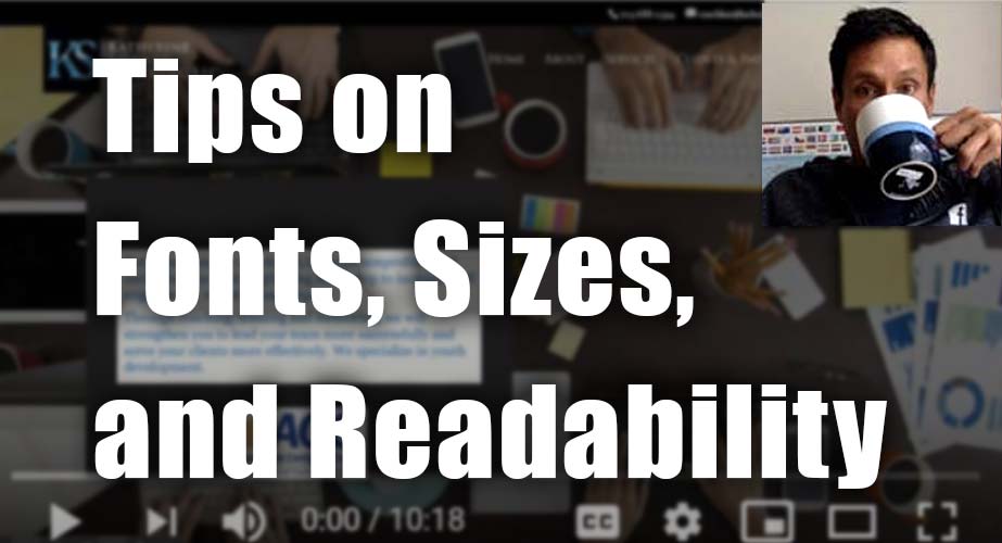
Click here if the video doesn’t show.
Besides an annoyingly noisy sip of coffee from me, in the video, you’ll walk away with these wisdom bits as I point out how they apply to her website.
- Engaging people with a compelling message and put it up front and center so visitors know WHY they should be at your website. The WHY dwarfs the HOW.
- For logos, go simpler, so that they are easy to spot and read. Don’t make them glamorous space hogs that won’t scale down. Keep em clean, tasteful, while matching your brand smartly. Avoid overdone or complex.
- Make your website menu simple, easy to locate and label the items intuitively.
- Be conversational on your website and instead of saying things like “Company X will help you with blah, blah, blah” say “I will help you with blah, blah blah”. If you truly have a team, then “We will help you with blah, blah, blah”.
- Make buttons intuitive by being exact and specific like “Book Your Session Now” instead of “I’m Ready!” or “Let’s Do This”. Sure, if you want to be energetic and fun, do something like, “I’m ready to book!”.
- Be the voice of your business, be present, and get your photo on the homepage instead of hiding like the wizard behind the curtains. Clients are looking for YOU to lead / guide / support / coach them. So you gotta
existbe present.
Katherine is a business coach at katherinespinney.com. She works with non-profits to strengthen their leadership and increase staff engagement, so that the organizations can fulfill their missions.
When you hit the LIKE button, an electric jolt is sent to my cell phone and I get a little shock. This puts a smile on my face knowing that I’m helping someone. Thanks! Zap me now.