Website Review – Self Employment Coach Debbie
Here’s a quick website review for Debbie Reeds. Her self-employment coaching website is at selfemploymentcafe.com
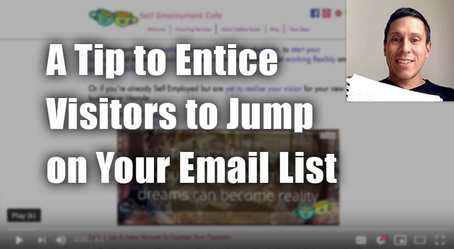
Click here if the video doesn’t show.
As I create, review or enhance websites, I always keep this guiding question in mind, How can I make this website better for attracting clients?
Key points for Debbie’s self-employment coaching website:
- Like – The logo matches your domain name. Great! I feel that I’m in the right place.
- Like – The menu is short with intuitive labels. Way to keep it simple. Nice!
- Like – The copy is focused on the client’s challenges and situation. Fantastic! That’s like the biggest thing for websites.
- Improve – Raise the font size. My laptop (very basic, default layout, Macbook air 13) shows it very small and wide. Go for about 100 characters wide. See what I suggest in the video.
- Improve – Tie in your giveaway to a benefit. Show that benefit right where the giveaway is offered. In your case, state “Get the checklist TO AVOID TIME WASTERS AND GROW YOUR BIZ FASTER”. Benefits are what people are after, and it’s a good move to keep people’s eyes on the prize. See what I mean in the video.
- Improve – When you use a dark text on a dark background, it’s hard to read. Instead, make the text white when using a dark background. It’ll be easier for people to read.
Want to say thanks? Just hit the LIKE button here. I appreciate it.