Website Tweak for Joanna
If you want me to review your coaching website, just schedule some quality time with me here, and we’ll find high-impact yet easy-to-do enhancements to improve your website for client attraction.
Below is Joanna Broughton’s personal development coaching website tweak I suggest.
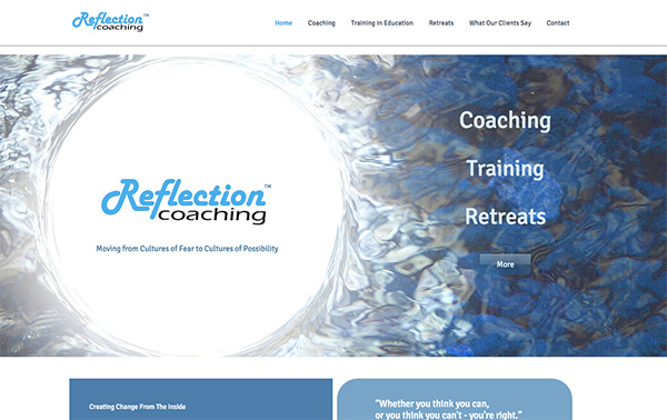
Before screenshot

Here’s my suggested tweak …
I really like the logo being in the top left and the menu following horizontally to the right. It leaves plenty of room on the page for juicy content.
Sadly, I need to scroll down to see any good content. As it stands, the “above the fold” content (that part visitors see right away) doesn’t grab me at all, and I can’t imagine who would be interested in that.
“Moving from cultures of fear to cultures of possibility” is nice but a bit “out there” and not really juicy enough for me.
Remember, people leave sites in seconds upon arriving, so that first screenful of content needs to be mouthwatering!
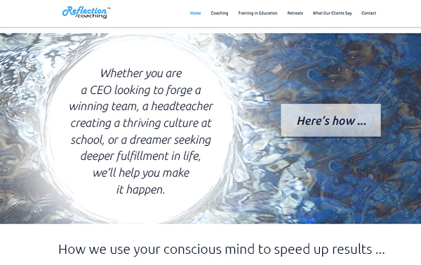
I recommend a big juicy headline or short (1-2 sentence) paragraph that is benefit loaded. Super juicy!
Here’s the after …

What’s your take? Got ideas to improve further? Dislike something? Love to hear from you. Comment below.

At first glance of the original I thought it was neat, clean and interesting, but the redo is so rich. You want to click Her’s how…. What a big difference.