Which Coaching Website Looks Better?
Below are two images of a website we are creating in the website course that started earlier month. Which one do you like better?
AND, can you tell why? There are two reasons.
See if you can guess before scrolling down.
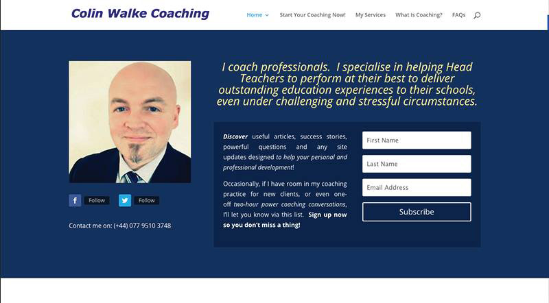
Here’s the first image:
Here’s the second:
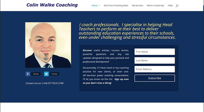
If you liked the second one better, you’re in the majority and here are the two reasons why …
Firstly, Colin’s face is looking toward the center of the page and feels like he’s looking and talking to you.
It feels like you’re actually interacting with him.
His attention is towards the reader and towards his message.
Secondly, and a bit more subtly, the text in the heading is aligned left towards the photo.
As a result, the elements on the page (the photo, text, and optin box) have a logical positioning with each other – they align to the photo.
In the first image above, the heading is centered and doesn’t align or arrange smoothly with the other elements.
People like looking at things that have a logical arrangement even if that arrangement is completely random.
Did you guess those two things?
Or, did you see something else? Love to hear from you, just post a comment.
The Second Website for sure!
The first one his eyes are kind of in your face!
They are too intense. They push you away!
The 2nd one is much better… more comfortable…
Maybe it’s just the angle but he is much more approachable.
Mike Kollin
So far, 8+ people agreed with you Mike. ANd yep, the angle, and also consider the font alignment of the headline.
Hi Kenn.
I guessed the second by virtue of the fact that the coach’s picture is facing to the message which suggests to me he is connected with what he is saying and teaching. I did not get the alignment aspect but it makes sense.
Best regards
Francois
Tres bien!