A Common Homepage Mistake — Case of The Missing Coach
I love sharing tips to help coaches improve their websites. There are so many good things one can do to improve engagement and show the tremendous value of coaching.
But as eager as I am to check out the coach’s entire website, I rarely get past the homepage without my “uh-oh” senses going off.
One common problem is what I call, Case of the Missing Coach.
It’s a lost opportunity to connect with a visitor and warm them up to you and your coaching.
It goes like this …
When people arrive at websites, the first thing they want to know is, What is this? They want to know what they are dealing with so they can comfortably dive deeper.
If it’s not clear, they become confused. They wonder if they are in the wrong place.
They may tip-toe around but are very skittish, ready to run away if it continues to be unclear.
I often see this …
Too often I see websites with an overly designed logo, a big image of a butterfly or flower, and a few concept-heavy words like empathy, catalyst, spirituality, or transformation.
But no coach.
And so we’re not sure what kind of website it is.
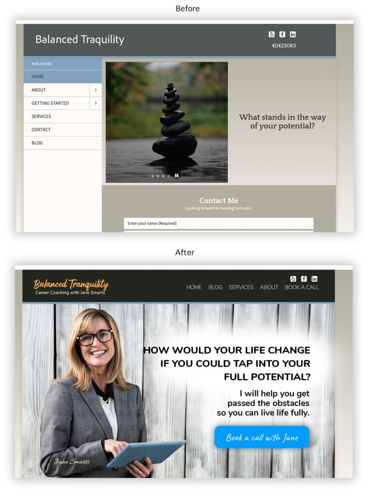
Here’s an example of a before and after of a website. It was based on a website of a real coach, but made anonymous for example purposes.

Can you see the difference?
Can you see how the second one makes it VERY CLEAR that it’s a coach’s website?
Incidentally, it also speaks to the client’s needs and desires too. It’s not just all about the coach. I wrote a lot about this design to attract approach in my book, The Coaching Website Guide.
At the least, have your photo, your name, and a short title like a life coach, success coach, or even health nut.
Better yet, get an action shot on there — one of those landscape photos in your office, out in nature, or working with a client.
A short video would be super duper, so people can also hear your voice
Remember …
Clients are coming to you for support. Not company XYZ.
So meet them at the front door with open arms, and ready to help them transform, change, grow, and succeed.
Be visible, be the voice, and be the professional the client can rely on.


As usual, Kenn, you share excellent advice. I worked with you a few years back marketing a beach retreat & your help was genius. Thank you👍
Katherine Bock, J.D., PCC
Dallas, Texas
Thanks for the kind words. Love your site!
If anyone wants to see a great example of being visible/present on a homepage WHILE writing copy to appeal to the clients, check out Katherine’s site.