The Coaching Website Guide
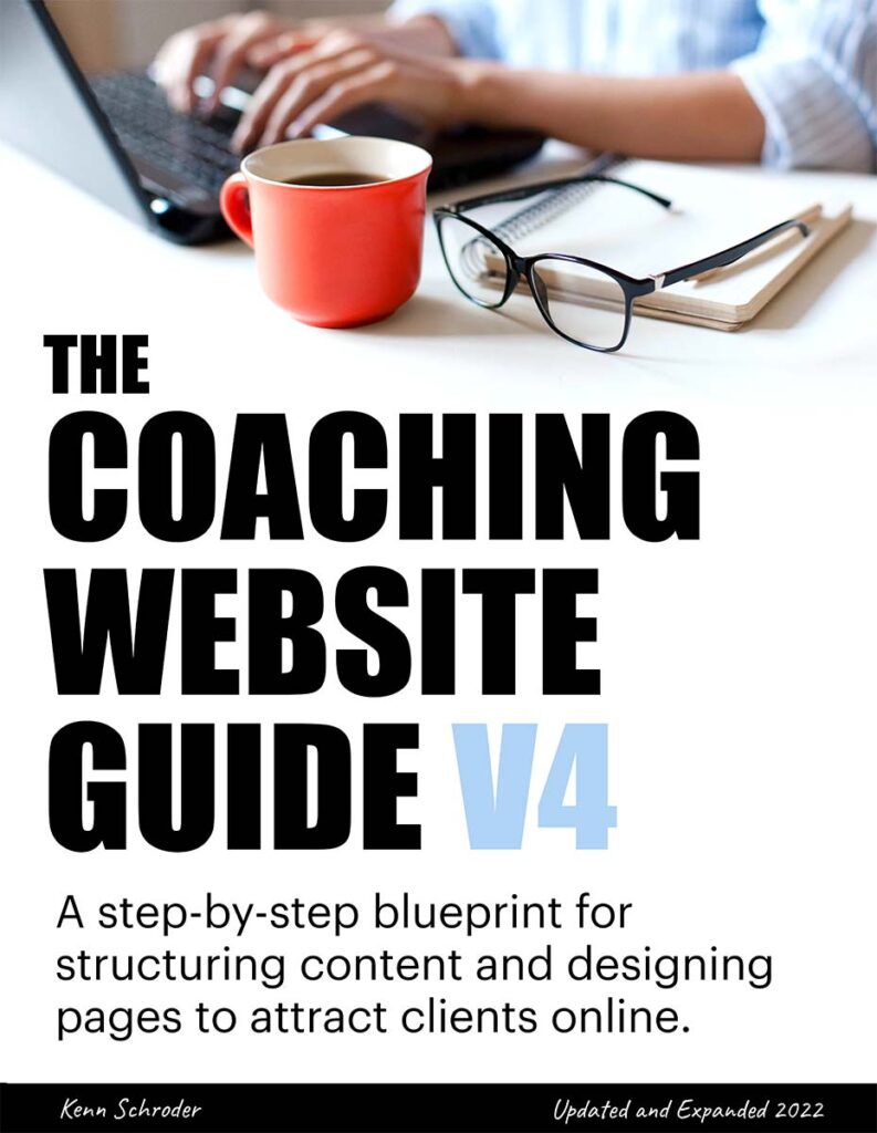
A step-by-step blueprint for structuring content and designing pages to attract clients online.
BUY PDF BOOK $97
Why Most Coaching Websites Never Bring a Single Client

I was having success with my clients’ websites. But I was curious about the rest of the world.
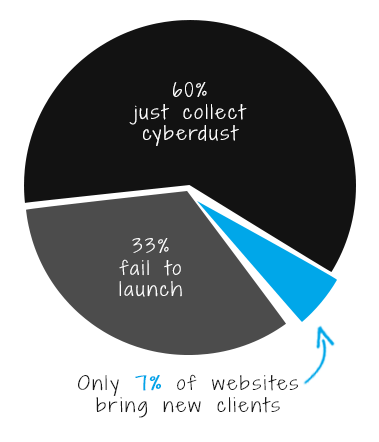
So, in 2012, I hopped on the phone with 45 random coaches to investigate. A month later, I found out that …
- 1/3 of websites never made it online
- 1/3 took forever to build
- 1/3 got it done fast
… and of the ones who did get it up, only three brought new clients.
Yipes!
Only 10% of websites brought new client leads.
Of the ones that did launch, only 10% worked. And so 10% of the two-thirds is just 7%.
This sparked me to write The Coaching Website Guide to help rectify the problem.
Imagine working on your website for months (some took years!) and spending lots of money on it, only to get nothing.
Worse — imagine having to start over.
Doubly worse — imagine having to give up on your dreams altogether.
:0
My website didn’t work for years,
until one trip to Paris …
From about 2001-2006, I redesigned my website over 20 times. Each time it looked a little different, but none worked — as in, they didn’t bring me any new clients.
It was until 2007, on my first work abroad adventure to France, that everything came together.

The week before flying out, I tried a new approach to my website. As a result, I signed up three new clients for over 10k of income.
I was blown away. It was like Keanu Reeves, Woooaaahhhh!!! moment.
After that, dozens of new leads came in each month. My little design business was smoothly sailing.
Reflecting, the Big Aha that changed everything was this …
The big discovery was that everything on your website must be designed to appeal to the client.
This includes the words, headlines, visuals, menus, buttons, colors, links, forms, cogwhistles, and doohickies. All of it!
Before, I did what most newbies did – get a stylish template, add wise quotations, and insert pretty pictures. Then fill it with industry jargon, list out my credentials, and then pray new clients would stumble upon me.
Waiting and praying do NOT work well. Thinking deeply about the client and making your website appeal to them DOES.
I took this newfound wisdom to the websites I built for my coaches, and they too, reaped the rewards. The guide below has all the juicy details.
Having succeeded, I went wild and reviewed over 1,000 coaches’ websites on LinkedIn.
I had to spread the word about my approach and help others do better. I’ve been the resident web designer in a few social groups, especially LinkedIn.
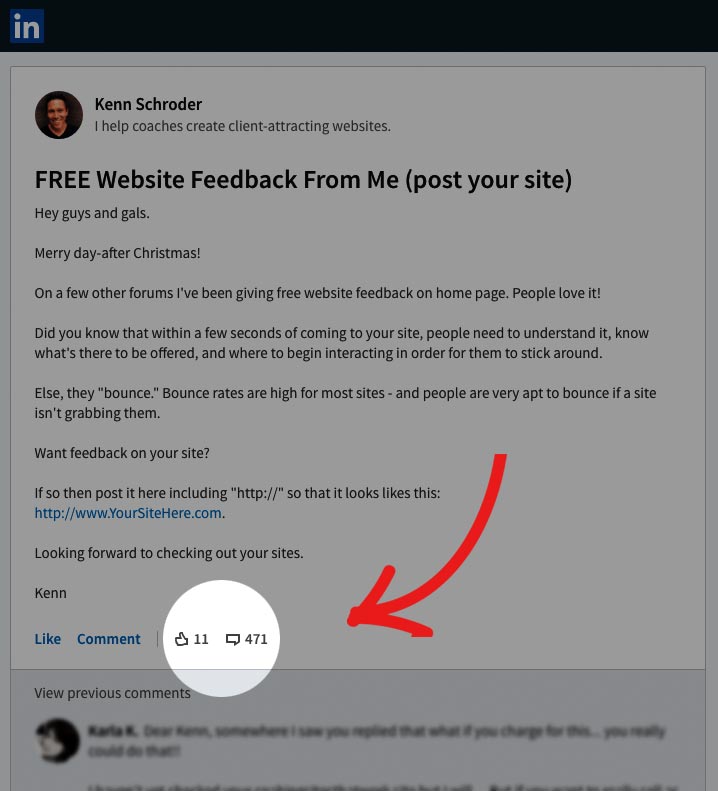
Here’s one discussion where I offered website feedback to the members. It lasted from 2012 that lasted a year with 471 comments.
And here were the top three problem areas I consistently saw …
Problem 1. The content was boring with …
- explaining coaching services in a vague and/or complex way
- randomly placed pictures and quotes that don’t flow
- a list of credentials and training that clients don’t know about
Problem 2. The sites were difficult to use because …
- the content was poorly organized with no logical flow
- there were too many fonts, colors, heading sizes and images.
- the menus were too long, and the labels were unintuitive
Problem 3. The coach was invisible
- there was very little info about who the coach was — some had no photo!
- the copy was in the third person, corporate speak, with no personality
- the coach’s best talents, experience, and stories weren’t shared
Obvious right? But these problems ran rampant. Boring, confusing websites that don’t connect with people aren’t gonna cut it.
Get my guide and do better — buy the guide below.
But don’t feel bad if your website is collecting cyber dust because …
If you cringe at the idea of anyone visiting your website, don’t feel too bad.
It’s common since …
- technology makes it too easy to jump in blind and make a mess
- there’s a galaxy of information out there that’ll suck you into a black hole of confusion
- web designers don’t understand coaching, so you still end up lost
Go find a shoulder to cry on, if needed. Then, fret no more and take advantage of my experience and get the guide below.
What’s Inside The Coaching Website Guide?
20 years of my best tips so you can …
Three Strategy Diagrams for a Website That Attracts Clients
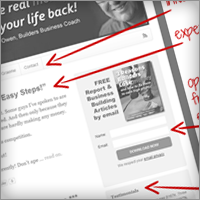
The Homepage Elements
Learn how to elevate your credibility and instantly engage visitors.

The Language Clients “Get”
Learn how to create content that excites your potential clients.
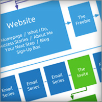
The Conversion Website Map
See how your website, pages, and emails lead visitors to contact you.
Check Out Chapter 1 for Free
Click here to preview chapter 1 to see if the content is good.
Don’t spend the next six months creating a — as one coach put it, “fugly” — website that you’ll be afraid to show anyone.
Instead, create a professional one you’ll be confident to share, knowing it will impress.
Yes, writing about coaching is a pain in the butt

I winced as a business coach I was supporting ended his calls with, “So, do you want some coaching?“
A long, painfully awkward silence followed on the call — that broke with, “I can’t afford it.”
People don’t understand coaching — and even if they did, explaining it doesn’t excite them enough to commit.
The key (in your website copy, phone calls, and all communications) is to forget about the word “coaching.” Instead, speak in the language clients can understand — which I teach in the guide.
Building a website can feel like climbing Mount Everest
There are many moving parts to deal with — content, visuals, and technology.
Finding a designer often comes with laborious back because they don’t know about coaching.
There are also the show stoppers like perfectionism, fear of failure, and writer’s block that get in the way.
To get it done timely, it’s vital to know what constitutes “done.” A detailed website map with content, visuals, functionality, structure, and calls to action is vital.
This guide will keep your head from exploding. Get it below.

What Coaches Are Saying About the Guide

Your guide was extremely helpful and gave me a blueprint I could follow in structuring my own coaching website and content.
The site is doing its job by attracting a regular stream of consultation requests and clients. Thanks so much for sharing your insights and wisdom.
~ Chiara Pietrogiovanna, Life Coach

I instantly felt like you’re someone I could spend time with, the same age, love helping people, love outdoor activities, and obviously bright (yes, I claim that! lol).
The guide is very nicely laid out in a step-by-step process for either assessing (if you have one) or creating (if you don’t have one yet) your coaching site.
I also like the clearly explained steps of getting a client – from delivering good content, taking them to your site, adding more good value, and offering them coaching after emails.
The fact that I bought this guide is obviously testimony to the fact that you practice what you preach. So many online “gurus” don’t. You feel authentic in my mind as a result.
~ Gideon Hanekom, Relationship Coach

You described how to make my website about the benefits to the client. I honestly thought I already had, but when I read your guide, I could see I was totally fixed on my own perspective and was explaining the processes.
I changed the text, got new photos taken, and wrote my free ebook in about four weeks. My website has already generated 13 new clients. The guide has been invaluable, and I’m really excited about the next phase of my business.
~ Hannah Hempenstall, Life Coach

Kenn, the section on the giveaway and opt-in box are absolutely priceless. If coaches followed that advice, they’d be well on their way to really understanding client attraction. PS – Thanks for helping the members at LinkedIn!
~ EG Sebastian, Client-Attraction

Web development can make even the brightest person’s brain feel like pudding. You lighten the heaviness with your approachable style and then feed lots of substance in “little bites” so readers don’t get overwhelmed.
~ Lisa Manyoky, Branding Strategist

Not everyone can write. Not everyone can hold an audience. Your Guide is very well written. I have the sitemap and hub model pages pinned on my wall. The way you built up the content writing section was done so nicely that even a novice can understand it.
~ Gary Henson, Business Coach

“What made it easy for me were the models, layouts, templates, formulas, and examples – and your subtle humor along the way. I like that. It makes it real, and it makes me smile. It doesn’t get much better than that.
~ Carol Leek, Business Coach

Kenn is providing what coaches and consultants need to market their business on the Internet effectively. Read and use this step-by-step guide to develop your expert website and your customized online marketing system to attract and engage more clients.
~ Mike Rafati, Incredible Coach

Kenn, I think you’re brilliant! The whole idea of the “expert website” resonates with me. This guide is going to keep lots of coaches from floundering for a couple of years, wondering why their site isn’t attracting clients.
~ Gayle Scroggs, Mentor Coach

It’s easy to comprehend and really simple to work with. I’ve finally narrowed my niche – a huge step after 2½ years in business. Thank you so much for making that available to coaches like me!
~ Anne Fischer, Success Coach

It’s really hard for coaches to see their service from the benefit to the customer/client’s perspective. I thought you did one of the best jobs of explaining that I’ve seen. Plus, the step-by-step approach was exceptional.
~ Barb Zeigler, Set and Get Your Fees

I like that the site is intentional and purposeful about getting clients. The message comes across to me loud and clear, “It’s not about you stupid but what your clients want,” – but you say that nicely.
~ Dr. Tim Conrad, Resilience Coach
Your coaching business dreams are worth it! Get the guide and put your best foot forward. 100% Happiness Guarantee and the bonus infographics too.
3 Bonus Tools When You Buy the Guide
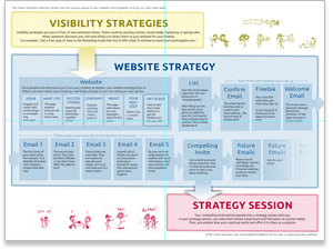
Bonus 1: The Client-Attraction Website Map
Print and stick this on your wall. This shows the components for attracting ideal clients, building instant rapport, and leading visitors to contact you.
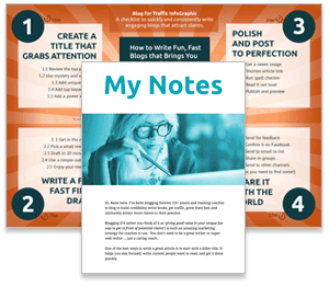
Bonus 2: Blog for Traffic Infographic and Notes
Use the “publishing is the new advertising” approach to get attention from potential clients online. My Private Notes show you how I reached thousands of visitors monthly, got over 14k subscribers, and earned over 90k in passive income — and I’m no one’s guru.
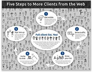
Bonus 3: Clients From the Web Infographic
If you want a website that brings in clients while you sleep, you must have a few things in place. When the coaches I work with aren’t getting enough leads, I whip this out and troubleshoot. It works like magic.
I want the guide!
Buy GUIDE below.
Buy Now $97

Design your website to attract new clients.
You won’t regret it.
- A simple PDF of my best advice
- Bonus 1: The Client-Attraction Website Map
- Bonus 2: The Blog for Traffic Infographic & Notes
- Bonus 3: Clients From the Web Infographic
- Kenn’s 100% Total Happiness Promise
Option 2 of 2: The Quickstart Kit $297
Dive right in and start building exciting momentum with these tools.

The Coaching Website Guide
Simple PDF of my best tips for a website that engages and excites visitors about coaching.

WordPress Videos
Quickly learn the basics and harness the #1 content publishing platform on the Web.

Design Videos
Learn how to make your website both eye-catching for visitors and authentic to your coaching style.

Web Coaching (Optional)
You get 30 days of direct email support, my personal feedback on your website, and launch challenge.
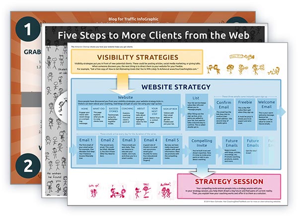
3 Bonus Infographics
See the big picture of getting clients online as well as the inner workings of your website.
100% Total Happiness Promise
I want you to get a lot from the guide. If you’re not satisfied with it, just reply to the email receipt within 30 days for a full refund. No fuss.
Common Questions
Got a question?
Great! I’d love to hear it. Contact me here.

