Coaching Website Tweak for Altazar
To improve Altazar Rossiter’s spiritual intelligence coaching website for client-attraction, here are before-and-after images along with my suggested tweak.
If you want me to review your coaching website schedule some quality time with me here and we’ll find high-impact yet easy-to-do enhancements to improve your website for client-attraction.
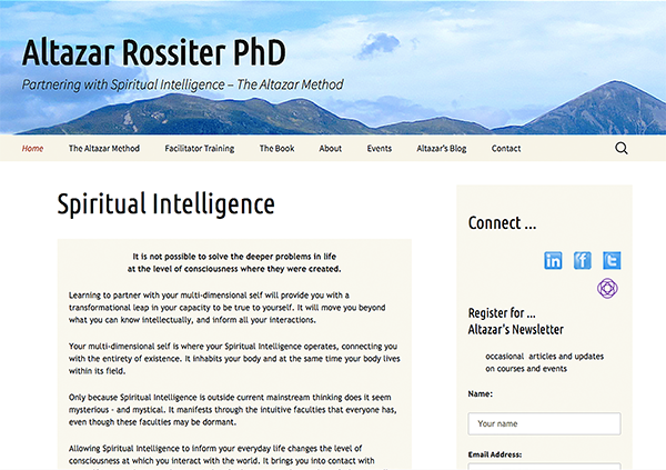
Before image …

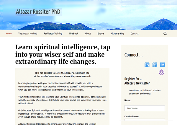
My recommended tweak …
I love the simple layout with lots of white space. I also like that the menu is just a handful of items. Nice!
I can see that you’re centering your message around a concept, spiritual intelligence. That’s cool.
But I expect that people can only guess what it means and while curiosity is good to peak, if there is no reason they should peek, then there’s the risk of a “false beta” – which basically means they get disappointed.
So to avoid the risk of people wasting their time, and to engage them right away with excitement, I strongly recommend you tie the value of spiritual intelligence to benefits in your headline.
After image …

What’s your take? Got ideas to improve further? Dislike something? Love to hear from you. Comment below.


Thanks for checking me out Ken.
I understand what you’re saying. Not so keen on the headline you suggest, but I’ll come up with something of my own that I’m more resonant with.
Thanks again.
Welcome. Try running both images above by 10 people you know.
Feel free to send them to this page to post their opinion, we can see what they think.
Also, ask perhaps for their ideas.
In the end, you try different pages / headlines out and see the response to truly know.