Tidy Up the Layout – a Simple Site Tweak for Angie
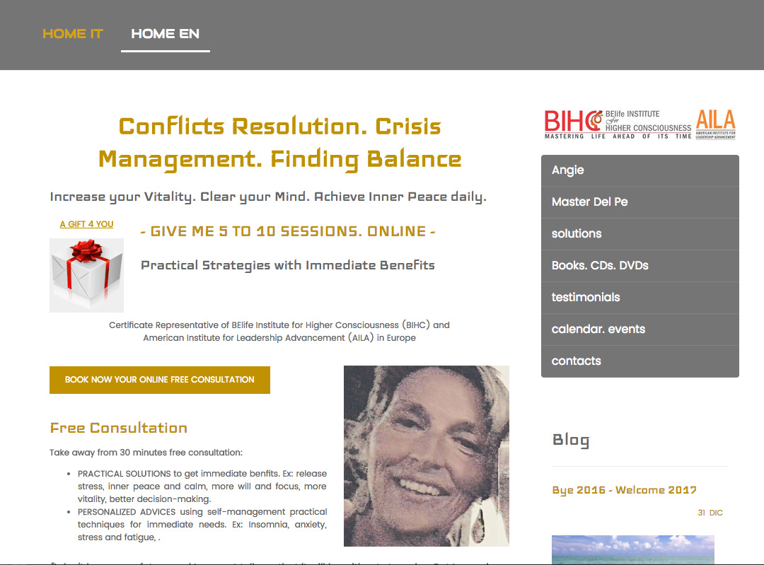
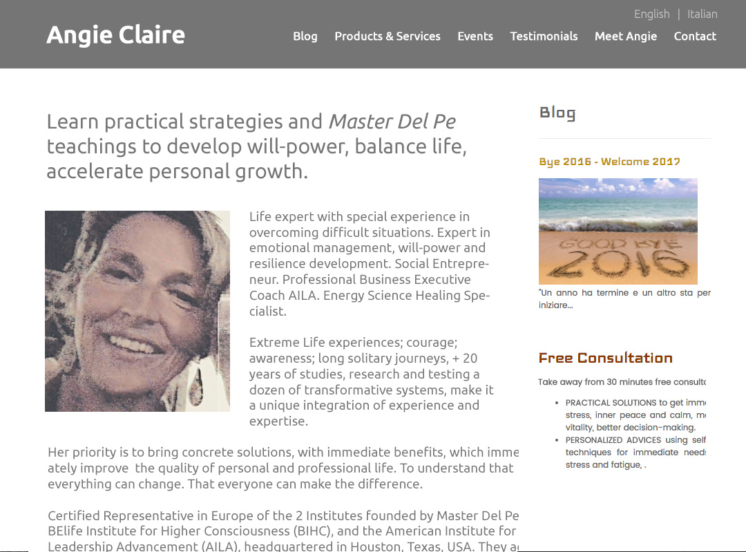
To improve Angie Claire Testai’s coaching website for engaging visitors quickly, here are before-and-after images along with my suggested tweak.
If you want me to review your coaching website schedule some quality time with me here and we’ll find high-impact yet easy-to-do enhancements to improve your website for client-attraction.
Here’s the before screenshot …

Here’s what I would do …
I like that you have a free consultation available and a big button to get it. Good.
The page feels scattered to me. There are too many fonts and text sizes and various elements without a logical order. It’s hard to follow.
I recommend a simpler layout based on what people would expect to see on a website.
Also, get your main benefits clearly stated so I know WHY I should be there.
Here’s the after screenshot …


