Start With WHY – Website Tweak for Anita
To improve Anita Kozlowski’s coaching website for engaging visitors quickly, here are before-and-after images along with my suggested tweak.
If you want me to review your coaching website schedule some quality time with me here and we’ll find high-impact yet easy-to-do enhancements to improve your website for client-attraction.
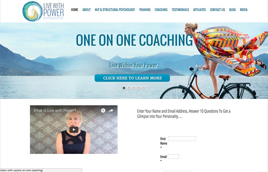
Before image …

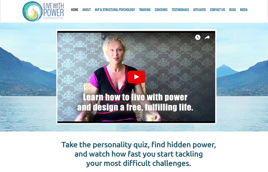
Here’s my tweak to improve it …
I like the vibrant images and sense of energy I feel at your site.
But, I struggle to know WHY I should be there.
The words I see are power, take action and change lives which are good, but not enough to engage me. I need more.
I need to feel a personal reason as to WHY I should be here.
Two suggestions: (1) Get more specific with your words and focus on challenges and benefits or (2) get a video up front and center and big so I can hear your message.
I’m assuming NLP training is not your main offer, but 1-1 coaching is. If so, I’d get rid of the sliding images and focus on the individual who is lacking power.
After image …


“One on One….Live within your power” I like these statements….The picture in the after is revealing to much cleavage!!! and I think a tattoo! I agree with Mary Franz….the flowing scarf is very refreshing! Maybe these are just female by design!!! I do not have a web site yet….I am looking for one! May be I should do this first! I have been a Health Coach for four years. The name of my business I believe could be a problem….The Plant Doctor!…..I am an advanced Master Herbalist Gardener….I relate to all plant life more than I do people…..I think this is my problem!!! Most people do not even consider plants as living and or intelligent. Even though we are not as intelligent and could not live without them. We have totally disrespected them from the beginning of time and have genetically modified them into monsters….
There is no such think as a plant weed…..humans are the weeds…..
Thanks for sharing that Rita … interesting points.
As you may know, the real proof in whether the first is better than the second is in the numbers.
That is, seeing if people take action at the site and ultimately end up call for coaching for signing up for something.
I’d check out HerbalDoctorRita.com and it’s probably available.
See this too: How to Find The Perfect Domain Name
https://coachingsitesthatwork.com/perfect-domain-name-setup-wordpress/
“Learn how to live with power and live life fully.” a suggestion… I like a more active word like “live” vs. design (which I imagine sitting at a desk doing)
I miss the woman riding the bicycle with the flowy scarf thing. That was super appealing to me. She’s “living”… she’s moving… she’s “in flow”
The video seems to bold where it is placed on the home page. I like to appreciate the environment first and then listen, so I’d opt for the video to be present, but further down the page…prominently placed…and the larger size is good.
“Take the personality quiz…” REally like this.
The script improves the value and benefit and does address the WHY… which is key.
Thanks Kenn. Good for you Anita… Great picture too.