Before and After for Kathryn Brown
Here is Kathryn Brown’s website tweak to improve it for client attraction. If you want me to review your coaching website schedule some quality time with me here and we’ll find high-impact yet easy-to-do enhancements to improve your website for client-attraction.
Below is a tweak I recommend to improve her site for client attraction.
One key to attracting clients with your site is to get them to subscribe to your email list so you can build trust, grow the relationship and promote your coaching. People buy from those they know, like and trust.
Here’s my tip to improve her website to boost opt-in rates. And as you can see, her site is quite creative, so we don’t want to lose that fun personality that reflects her.
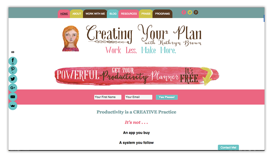
Here’s the before …

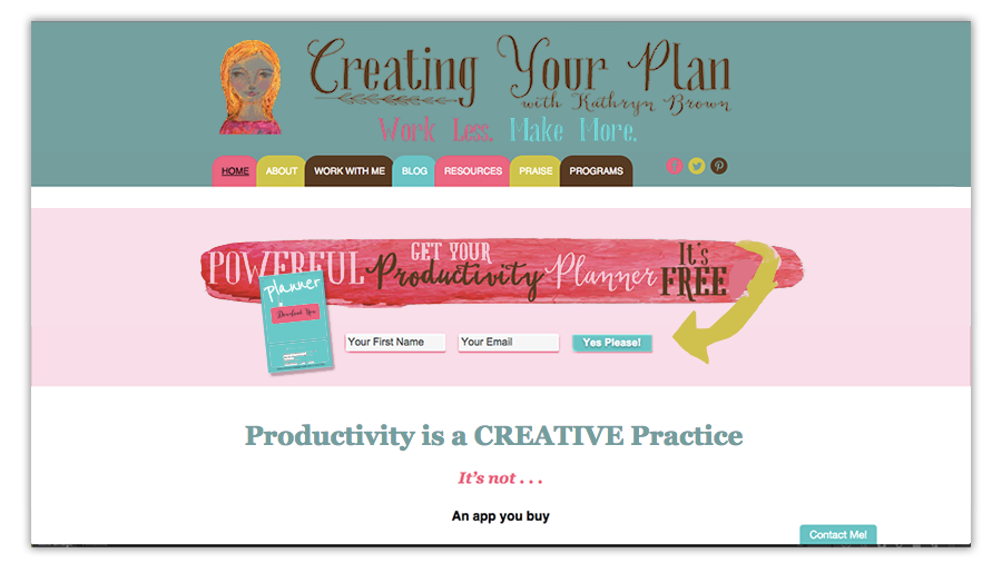
My suggested tweak to improve …
Thanks for posting your site Kathryn. I like the simple URL and fun creative vibe on your site. I like that you have an opt-in box right on your home page. Great for marketing!
One thing I’d improve is to make the opt-in clearer. It’s confusing to me with all the creative pieces floating around. I suggest tie-ing them together so it’s clear exactly where and what the opt-in is. A simple background could do the trick.
Also, I’d also add a visual for the free giveaway to make it even clearer and more attractive to sign up.
I like the free giveaway idea that we are already productive, we just need to harness it. Fun concept, attractive. And I love how you harnessed your own creativity – I’ll assume you made the visuals. Yeah?
Here’s the after …
What do you think?
Does the creative vibe still hold? Is it clearer where the opt-in box is? How does it feel now? Disagree with what was done above? I’d love to hear from you. 😉


This is a great tip Kenn. You are definitely a master at what you do
Thanks so much for the feedback, Kenn! I’m working on incorporating one of your ideas right away — adding a visual for the freebie I’m offering. As far as the background color to ground the different areas — I think that’s a great idea as well. It keeps the vibe of the site, but will take a bit more time to implement.
Thanks again!
Kathryn
Great!
Yeah, I know it can be tough to work around with graphics.
Love the creativity … see if you can’t improve the usability/clarity.
Come back and post it here?
Very welcome. Thanks for sharing your site with us. Nice.