Website Review for Bernadette
To improve Bernadette Romero’s life fulfillment book website for client-attraction, here are before-and-after images along with my suggested tweak.
If you want me to review your coaching website schedule some quality time with me here and we’ll find high-impact yet easy-to-do enhancements to improve your website for client-attraction.
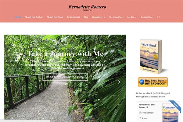
Before image …

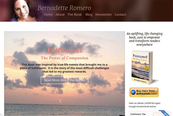
My recommended tweak …
I like the book on the right and that one could get it on Amazon.com. It shows you’re an expert.
I recommend putting your face on the home page, a good headshot, and BE the expert. Visible and present.
Clients who pay well prefer to hire experts and gurus. Such clients are accustomed to investing in 1-on-1 help.
After image …

What do you think?
Like the suggestion? Have ideas to make it even better? I’d love to hear from you. Just comment below.


Been exploring your website Kenn and love your before/after. Great stuff. A comment on this one – I find the lettering on the header hard to read. Either needs a lighter background or more prominent colour for the type. Cheers, (And I know my site is not perfect:).