Website Tweak for Billie – Being Specific and Simpler
Here’s a website tweak for Billie Attaway. If you like to get an idea to improve your website for client attraction just schedule some quality time with me here and we’ll find high-impact yet easy-to-do enhancements to improve your website for client attraction.
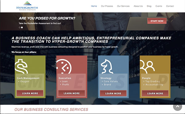
The before …
My suggested tweak …
I like the top area with plenty of white space and an easy-to-understand menu. Nice, roomy, safe.
The rest of the page scares me. It’s so busy, with floating blips of text, images, and boxes all jockeying for attention. And while there are plenty of benefits statements (good), I’m not sure where to begin or what to click on first.
I recommend making each section clearly different from the previous one and, within each section, go simpler. Also, make it clearer why I should read before clicking – more specifically.
(side note: learn more buttons don’t work in the second section of the home page)
Kenn
The after …
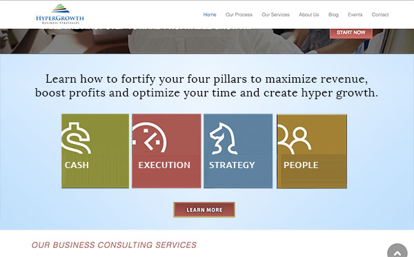
What do you think?
I love hearing from website visitors. Love it! Tell me what you think, even if it’s small or even if you’re a little hesitant to post. Just comment below.