Biggify Your WHY – Nicola’s Site
I’ve been reviewing coaching websites on LinkedIn. If you want yours reviewed, find me on LinkedIn and post your site. If you’d rather not wait, then schedule some quality time with me here, and we’ll find high-impact yet easy-to-do enhancements to improve your website for client attraction.
Here’s an example of how to make a WHY bigger using Nicola’s site …
Nicola’s site is here: http://www.whyforlife.com/
I like the white space. It makes reading and viewing comfortable.
I like the simple domain name as well as it’s easy to type in, remember, and share.
To make the message stronger, I’d bring out your BIGGEST WHY to the bestest client.
Like this … (and I’m guessing biz/orgs are more ideal based on your About page content)
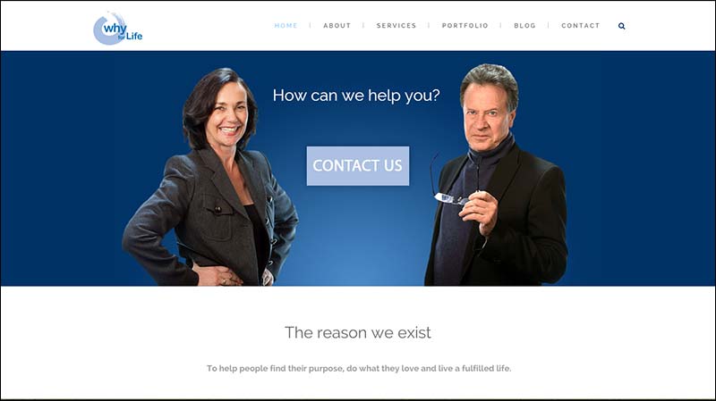
BEFORE:
AFTER:
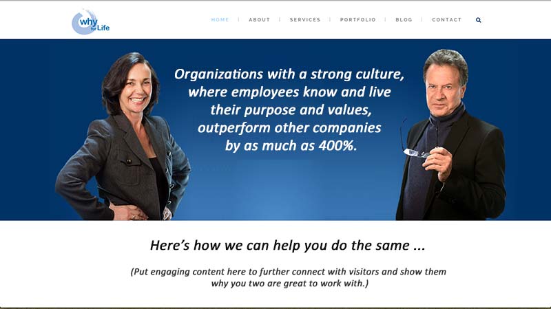
Visitors WANT to know the BIG WHY right away when they arrive at your site.
Without it, they quickly leave.
Two more suggestions to BIGify:
1. Get engaging content to further interest visitors before telling them to contact you. Get this content to be immediately noticeable “above the fold” (the part of the viewing screen you see before scrolling). In the above, I noted this.
While it’s great you have a call to action prominent, it’s even better to build interest, excitement, trust, and likability before calling the action.
2. I’d also focus your BIGgest message on your BESTest type of client so you attract more of them. At current, your home page seems to point to life coaching for individuals. Staying broad like this doesn’t serve any kind of visitor – and doesn’t help me understand what you do and be able to refer you.