Before-and-After for Charbel
To improve Charbel Abou Hanna’s executive & leadership coaching website for client-attraction, here are before-and-after images along with my suggested tweak.
If you want me to review your coaching website schedule some quality time with me here and we’ll find high-impact yet easy-to-do enhancements to improve your website for client-attraction.
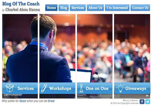
Here’s the before screenshot …

Here’s what I’d do to improve …
I like the images you’re using on your page. They give me a good feeling without being to “stock” looking. Nice.
Sadly, I don’t know what you’re site is about or who’s it for. I suggest making the image smaller and getting some good client-focused copy on the home page.
You need to grab attention from people right away and a big juicy headline or tagline is a great place to start – even before they scroll or click.
I looked around your site and came up with this “” and made a before and after image of your site.
Here’s the after screenshot …

What’s your take? Got ideas to improve further? Dislike something? Love to hear from you. Comment below.

