Site Tweak for Karen
To improve Karen Kramer’s life coaching website for client-attraction, here are before-and-after images along with my suggested tweak.
If you want me to review your coaching website schedule some quality time with me here and we’ll find high-impact yet easy-to-do enhancements to improve your website for client-attraction.
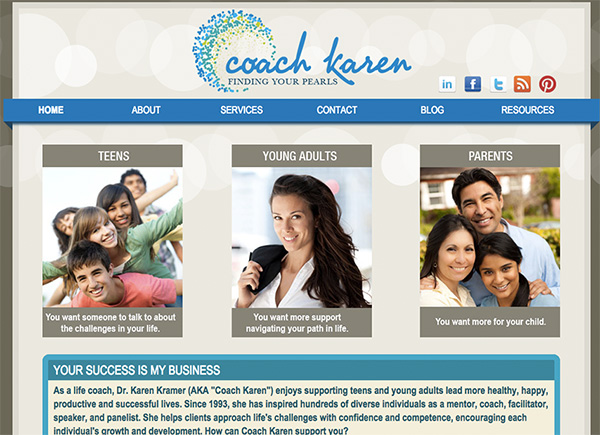
Before image …

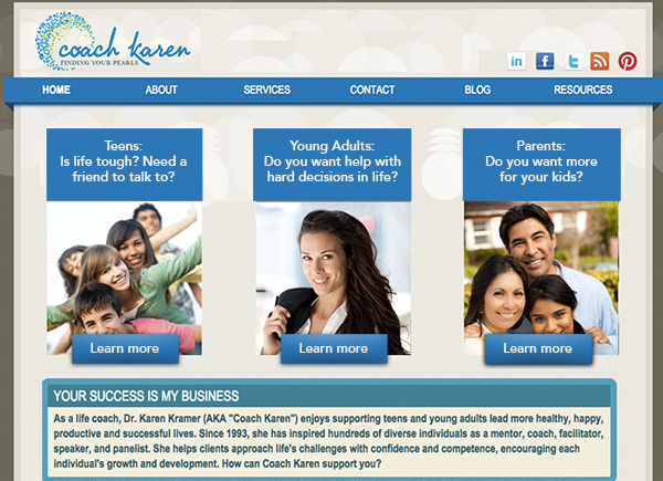
My recommended tweak …
I really like the simple layout. I like how you have 3 boxes for the three markets you’re targeting.
To make it more engaging, I would do two things: (1) Make the headlines for each of your three thingies more prominent and (2) make it clear that those are buttons to press. People need motivating headlines and they need clear, obvious action steps.
I like your photo too – killer smile! I’d get that on the home page.
After image …

I’d love to hear your thoughts, just post below.

