
Website Review for Kelly
To improve Kelly Fryer’s teen coaching website for client-attraction, here are before-and-after images along with my suggested tweak.
If you want me to review your coaching website schedule some quality time with me here and we’ll find high-impact yet easy-to-do enhancements to improve your website for client-attraction.
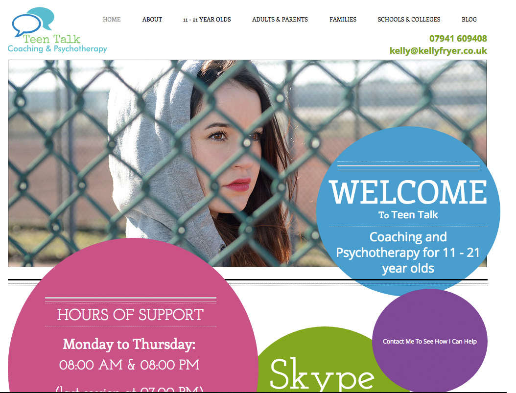
Before screenshot …
My suggested tweak for client-attraction …
I love the colorfulness of the page – it adds life. I like that the menu labels are based on the person they serve. The logo and menu are perfectly positioned for ease of reference and use. Nice.
It took me about 30 seconds to figure out what the site was about and had to scroll and read body text to do so. I came up with “psychotherapy for teenagers”.
A website’s purpose and value needs to be instantly apparent, in seconds, without scrolling or heavy reading. And it needs to be juicy, else why would people stick around?
One quick tweak I’d make is to bolster the tagline while reducing the space-hogging of images and bubbles – they are “features” than benefits which can come later in the content.
After screenshot …

Does this spark any reactions, thoughts, ideas or suggestions? Let’s hear it! Post below. 😉
The second one is more organized but the 1st pic arrives at the heart of the problem and youth can say: “oh, that’s how i feel”.
The second pic is to far from truth. And the pictures are too much “don’t worry, be happy”.
In the 1st one I think that Kelly really understands what is going on, in the second one i think that Kelly has a big and very organized office, but I feel to much detachment.
May be you can integrate the very nice organization of the 2nd one making saves the deepness of the 1st one. Thanks for understanding my itanglish and all the best! 🙂
Thanks for the comments Angie. On her site, the images slide through a bunch of different ones. A slider effect. So you get all kinds of images. I find sliders a neat effect, but not ideal.
See see her site.
A much needed service for kids.
I like what Kenn has done as the Bubbles took over your site plus I would make your email address and tel. number in the same colour as Teen Talk on the left.