
Coaching Website Tweak for Suzanne
To improve Suzanne Lieurance’s coaching website for client-attraction, here are before-and-after images along with my suggested tweak.
If you want me to review your coaching website schedule some quality time with me here and we’ll find high-impact yet easy-to-do enhancements to improve your website for client-attraction.
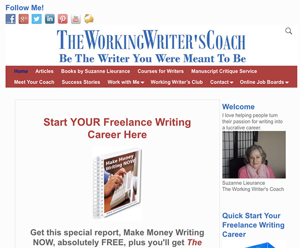
Here’s the before screenshot …
Here’s the feedback I gave to improve the page …
You’ve got a sweeet URL. I like how it speaks to the market. Superb!
The top area, header is super busy. I expect you did what you could with the resources given to you. I’d super simplify it and bring out the vital stuff like the list invitation and your blurb and then recede the formalities like the logo and menu.
Also, I expect you are aiming for special keywords (courses for writers) which is great and all, but be wary the trade off of usability. You can both have a great, easy simple menu and still have long-tail links. Personally, I’d opt for usability first, seo second … but really, you can mix both well.
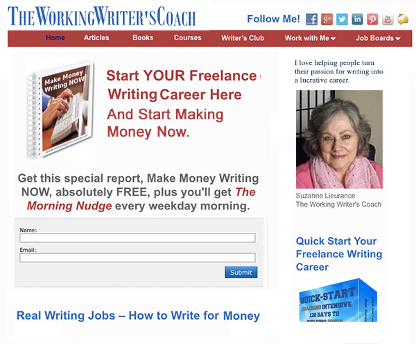
Here’s the after screenshot …
What’s your take? Got ideas to improve further? Dislike something? Love to hear from you. Comment below.
I like your friendly face, more prominent with Kenn’s magic and overall it now looks just right.
Good luck to you