Coaching Website Review – Life Coach Julia
Here’s a quick website review for Julia Pereira Dias. Her life coaching website is at growintobeing.com
Click here if the video doesn’t show.
As I create, review or enhance websites, I always keep this guiding question in mind, How can I make this website better for attracting clients?
Key points for Julia’s life coaching website:
- Lots of white with the colors of the birds and the line at the top feel good right away.
- The menu and contact info at the top are hard to see. Light grey on white is hard to read. Make it darker.
- It’s good that your site title Grow Into Being matches your domain name. Nice!
- The menu is obviously located, that’s good. Suggest moving it to the right and the logo to the top left and bring up some content onto the page for people to read. It’ll engage folks into your content to find out what you’re all about, and why they should work with you.
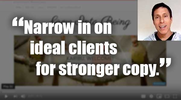
- The message feels week. I want to see a stronger message that speaks to your ideal clients with a powerful message. You may be a generalist kind of coach, but if you look at your clients and places you tell people about what you do, I suspect you could narrow in to something more specific.
- Get your picture onto your website. Go get a good one. See this article: How To Get a Great Headshot
When you hit the LIKE button, I get an electric jolt sent to my cell phone.
This quick shocker puts a smile on my face knowing that I’m helping someone ;). Thanks for that!