
Before-and-After for David
To improve David Rowe’s executive coaching website for client-attraction, here are before-and-after images along with my suggested tweak.
If you want me to review your coaching website schedule some quality time with me here and we’ll find high-impact yet easy-to-do enhancements to improve your website for client-attraction.
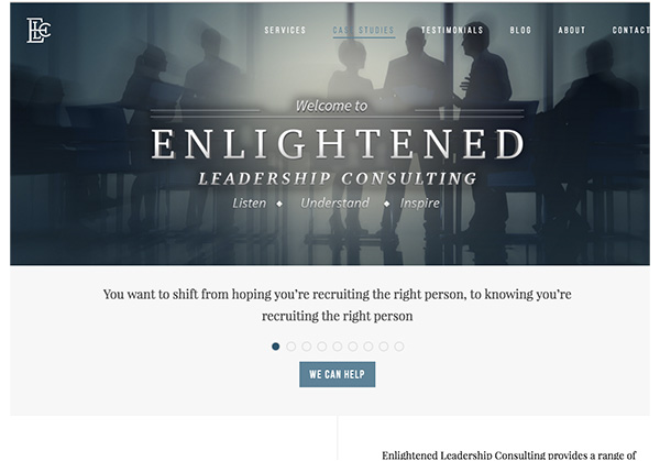
Here’s the before screenshot …
Here’s what I’d do to improve …
I like the nice fresh modern look. I also like the white space which makes it easy to read. Nice.
I find most coaches (or site owners) want their carefully crafted (often expensive) logo to be the biggest thing on the page. I find that clients (your buyers) want to know what’s in it for them to be the biggest thing on the page.
And using sliding images or sayings or content that makes you wait totally sucks for the visitor (but designers and site owners love the visual effect).
I’d flip things around and start with the client.
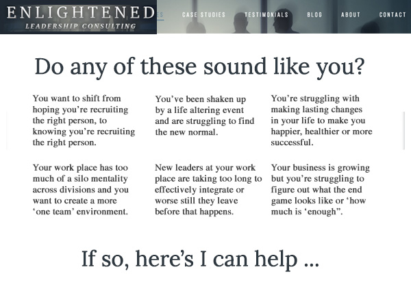
Here’s the after screenshot …
I’d love to hear your thoughts, just post below.
Personally I prefer Kenns makeover to the original but would prefer to see David’s Name on the page some where.
I feel apart from the words, the former look was more attractive. I as a potential client would close the site, the moment I see all those new texts in chunks right on the first page there..
Thanks for sharing that Bushra.
This before and after, I’ll admit, was tough to do because of the many messages … and I’m working from just a screenshot (hard to manage graphics without hours of editing).
Appreciate your perspective.