Pump Up the Volume – Coaching Website Tweak for Denis
To improve Denis Niedringhaus’ coaching website for engaging visitors quickly, here are before-and-after images along with my suggested tweak.
If you want me to review your coaching website schedule some quality time with me here and we’ll find high-impact yet easy-to-do enhancements to improve your website for client-attraction.
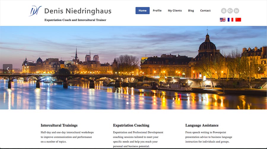
Before screenshot …

Here’s my feedback …
I love the tagline for your site. It helps me know what’s here right away. That’s super.
I suggest you get your big-picture message (I call this your core message) across louder by getting it seen when visitors first land. Pump up the volume so to speak.
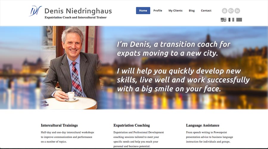
Put both your face and your benefits into that big picture area.
The faster and easier it is for people to know what the site is about (your services) and why they should be there (great expat life) the more they’ll engage and check you out.
After screenshot …


Hi Kenn! and thank you all for these positive comments! I’ve finally finished the English version. (the Chinese and French translations will be out soon.) We worked and worked on getting the webiste to look nice on a cell phone/Iphone…so the opening page “message” isn’t quite aligned. (Small sacrifice). You were absolutely right though, about the message on the opening page…simple and direct. Cross your fingers for me guys! This one was MONTHS in the making! : )
Awesome Denis! Way to take action. You may need to tidy up a little bit, but I think you’re going in the right direction.
Hi Kenn, Very night solid feedback – The site looks way better now.
I think I am going to send some of my friends over to you get your ideas about there site
Thanks for the positive words Dani. Much appreciated.
Hi – this one made a big impact on me. The first one was a wonderful image, but could have been for real estate (important for setting in a new place, but not core to the offer!). The second one is just great – the cafe in sharp focus, the remainder of Paris in the background, and a great model for the great big grin too – just fab. Congratulations and good luck!
Thank you so much Kenn. Just by pure coincidence, I had the gentleman who designed this website over for coffee this morning. We are re-designing it to add a Call for Action….”Click here to get your PDF on Staying Safe in Paris.” Instead of putting this just next to my café photo….I will put the “Name” “Email” and Get PDF button just below the opening page photo. I am going to modify (slightly) your message….”I’m Denis…blah, blah, blah…” .it sounds friendlier and I promise results.”
Is anyone bothered by the café photo blended in with the blurry Seine River photo? Or does this work?
Thanks! : )
Merci beaucoup!
I think your smiling face is the important thing. Cafe or not … probably doesn’t matter.