Site Tweak for Ed
To improve Ed Herzog’s Life coaching website for client-attraction, here are before-and-after images along with my suggested tweak.
If you want me to review your coaching website, schedule some quality time with me here, and we’ll find high-impact yet easy-to-do enhancements to improve your website.
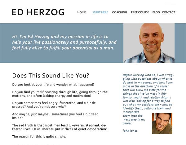
Before screenshot …

My suggested tweak for client attraction…
I love the domain name as it’s simple, short, and easy to spell.
I also like the simple layout of your site and that your copy is focused on the visitor. Nice.
The biggest thing I’d suggest is more copy that motivates me to want to engage with you. The top of the home leaves me feeling a bit empty. I’d engage people right there and remove the “start journey” button – moving that page’s content to the home.
It’s more personal and engaging.
A few other pet peeves: Have a consistent menu so people don’t get lost. Get rid of links opening in new windows as it clutters the browser and makes it hard to click back.
Also, typo “cultivate” on the home page.
After screenshot …
What’s your take? Got ideas to improve further? Dislike something? Love to hear from you. Comment below.