
Nicky’s Educational Diagram to Attract Clients
As you know, it’s my mission to create websites that sell clients on you before they even call you. Ideally, they show up on the phone eager to learn more, eager to share their story with you, and eager to work with you.
It’s great when that happens.
In this blog post, let me share with you one solid piece of content to have on your website – an educational diagram.
Oh hey! If an idea comes up for a diagram for you, please post it in the comments. I love hearing from readers and see what they dream up. Perhaps we can flesh your idea out to something masterful. Just post below.
An educational diagram is a drawing, an illustration or other visual that teaches your visitors something new about how to succeed.
It’s a learning tool.
It gives people a framework to see some aspect of their situation more clearly.
It also builds your credibility as an expert, a smarty pants, that “expert” whom clients love working with.
Let me show you what I mean with some examples …
For example, here’s a common one you may have seen about how to choose the BEST tasks to work on.
I’ve seen this diagram a few times over the years, but here’s visual I quickly Googled which is offered by The Coaching Tools Company, founded by Emma-Louise Elsey. Thanks Emma!
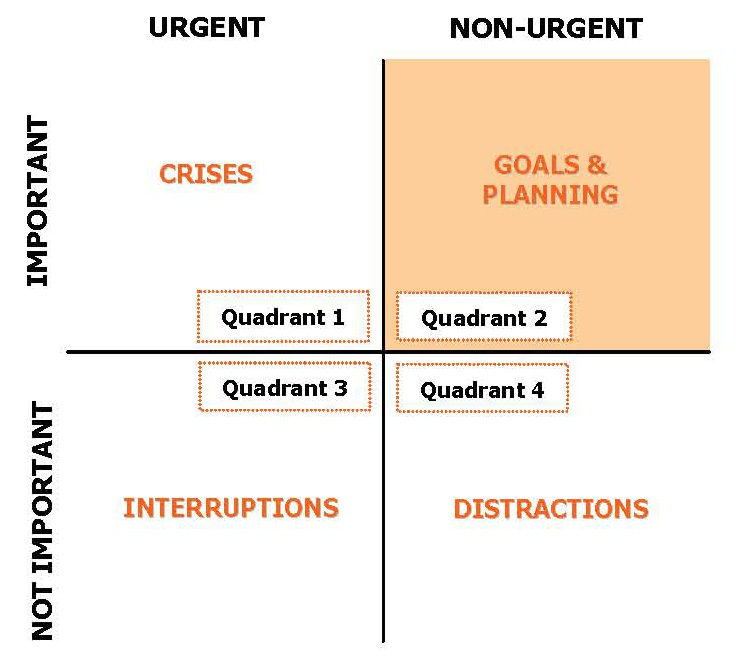
As you can see, from the visual, it’s best to avoid interruptions and distractions and focus on non-urgent, important tasks if you want to reach your goals.
This is a sweet diagram for any coach to use, especially productivity or business coaches.
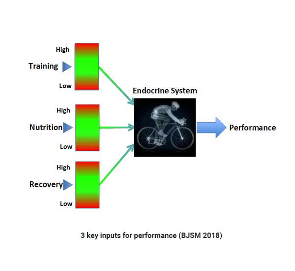
Here’s another educational diagram from dancer performance coach, Dr. Nicky Keay, who I recently listened to on a podcast.
I love good podcasts on health, sports performance and mental cognition.
In a recent one, athletic performance coach Dr Nicky Keay talked about the suboptimal health and suboptimal athletic performance consequences of low energy availability.
I was compelled to check out her website for more insights as my basketball energy has been unpredictable.
On her website, I ran into a diagram she labeled 3 Key Inputs for Sports Performance. I found it simple and brilliant. A nice piece for her to have for credibility.
Here’s the image:
You can see it live on her website here.
In the podcast, she talked about a common problem of eating to little among dancers. The idea of being thin and light lead to many dancers under-eating and problems with energy and appetite. Simply increasing caloric intake did a lot to improve strength and agility.
Her diagram teaches a lot about improving performance like:
- training too much is bad
- recovery and nutrition seem AS important as training
From the visual, I get that there’s a lot more to learn like:
- how “the endocrine” system works
- how do I optimize nutrition
- what would be too much nutrition (red area)
- how can I improve my performance
The big takeaway is that this visual taught me something and in turn I see her as a talented coach.
Great illustration Nicky!
Here’s one of my very own …
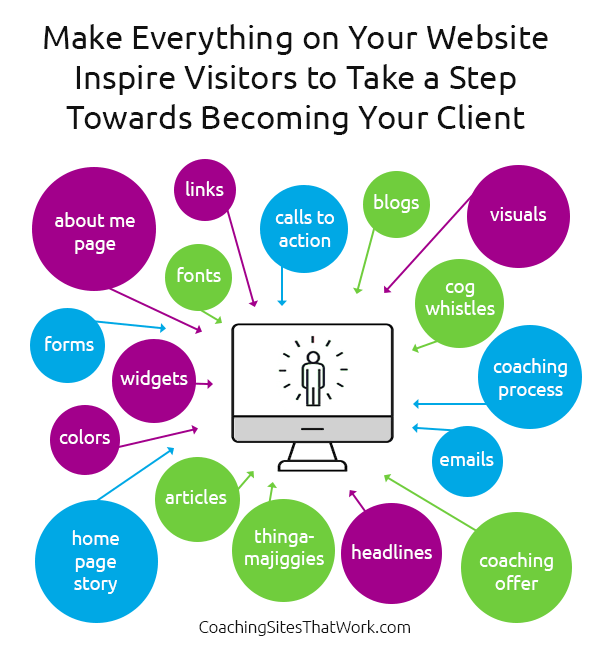
This teaches folks to keep their ideal client in mind as the design their websites and that everything plays into that idea.
It’s a must-do if you want to attract them.
Where can you use your educational diagram?
You can use it in all kind of places both on your website and in your online marketing like:
- on your How Coaching Works page
- in an article
- in a blog post discussing the visual
- on your website’s homepage
- on social media as something to share
- in your freebie
- on your LinkedIn profile as a credibility piece
And if you make it all pretty, people will love it, share it, like it and that’ll get your name in front of a lot more potential clients.
In summary
Remember, your website’s job is to build your credibility high so that visitors see and believe that you can help them as their coach.
Create a sweet educational diagram to develop your image as a guru and use it to attract more clients to your coaching business.
For another great way to create your illustration, read How to Create a Visual to Show the Value of Coaching – Venn Diagram.
Any thoughts or ideas coming to mind? I love to hear about them. Post below.
Good suggestion Kenn, the site I’ve created is a bit more wordy than I’m used to & I like the idea of using diagrams. I downloaded the Ideament app to create this one…
https://www.deborahreeds.com/services/
A great one, Kenn! My content is seriously lacking in visuals. I don’t find it so easy to create diagrams. Btw, the importance/urgency one is from Stephen R Covey’s “7 Habits of Highly Effective People” – a brilliant book which changed my life when I first read it in 1991.
Hey Peter. Ahh, I haven’t read that in like over 18 years ;P
Check out the Venn Diagram approach, maybe it’ll help you piece together something handy.
How to Create a Visual to Show the Value of Coaching – Venn Diagram