
Before-and-After for Linda
To improve Linda Berger’s empowerment coaching website for client-attraction, here are before-and-after images along with my suggested tweak.
If you want me to review your coaching website schedule some quality time with me here and we’ll find high-impact yet easy-to-do enhancements to improve your website for client-attraction.
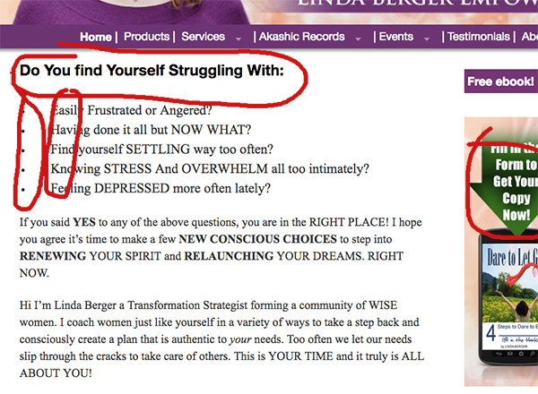
Before image …
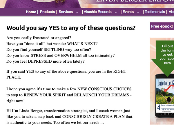
My recommended tweak …
I really like how your message feels, the words in your 3R formula. Also, your smiling face prominent is a big plus for me. Nice job. I feel like you read my book 😉
What really sticks out for me is copy, structure and capitalization – a bit all over the show. (I’m guilty of this, so I can’t throw the first stone). I’d clean it up while keeping your excited voice style.
After image …
I’d love to hear your thoughts, just post below.
I don’t like CAPS. Check any newspaper the only place you’ll find CAPS is in adverts where they feel the need to SHOUT.
Upper and lower case gets your message across loud and clear.
I’m generally against them myself. Good point there Bill.
Thank you Bill. I will make the caps changes.